METHODOLOGICAL WORK
On the topic:
"Stylization of plant forms in the ornament"
Polishchuk Olga Veniaminovna
Teacher of children's art school No. 1 named after. N.P. Shleyna.

Kostroma 2015
"Art is an abstraction, extract it from nature, fantasize on its basis, and think more about the process of creation than about the result."
Paul Gauguin
Content
1. Explanatory note. The concept of ornament and its types.
5. Summary of the lesson on the topic: "Stylization of plant forms in the ornament at the lessons of decorative composition."
6. List of references.
7. Creative work of students of the Children's Art School.
8. List of diplomas of city, regional, regional, international exhibitions-competitions.
1. Explanatory note
Modern world culture is the owner of a huge heritage in the field of all types of fine arts. Studying the greatest monuments of architecture, painting, sculpture and decorative and applied arts, one cannot ignore another area of artistic creativity. It's about decoration.Ornament is part of the material culture of society. A careful study and development of the richest heritage of this component of world artistic culture contributes to the cultivation of artistic taste, the formation of ideas in the field of cultural history, and makes the inner world more significant.
The literature on ornament can be extensive. The text in all works has a secondary role. I came to the conclusion that it is necessary to talk about ornament in composition lessons, which would give the student an idea of its main forms. I will touch more on the floral ornament. I called my work "Stylization of plant forms in the ornament", in it I want to show how plants can be transformed into an art form.
It is known that nature and art are closely interconnected. Painting and sculpture are based on a more or less direct imitation of nature. The ornament is also based on the imitation of nature and, indeed, for the ornament there are a lot of prototypes in nature.
Plants, animals, people and works of art of human labor serve as the prototype for the ornament. How, then, should the artist transform a pattern taken from nature into a form and color that, in the form of an ornament, could correspond to its purpose? What is an ornament in comparison with the prototype in nature? It is an ornament made by a human hand, transformed by his imagination.
Ornament- a pattern based on the repetition and alternation of its constituent elements; designed to decorate various items. Ornament is one of the oldest types of human pictorial activity, which in the distant past carried a symbolic and magical meaning, symbolism.
The emergence of the ornament goes back centuries and, for the first time, its traces were captured in the Paleolithic era (15-10 thousand years BC). In the Neolithic culture, the ornament has already reached a wide variety of forms and began to dominate. Over time, the ornament loses its dominant position and cognitive significance, retaining, however, an important streamlining and decorating role in the system of plastic art. Each era, style, consistently emerging national culture worked out its own system; therefore, the ornament is a reliable sign of the belonging of works to a certain time, people, country. The purpose of the ornament was determined - to decorate. Ornament reaches a special development where conditional forms of reflection of reality prevail: in the Ancient East, in pre-Columbian America, in Asian cultures of antiquity and the Middle Ages, in the European Middle Ages. In folk art, since ancient times, stable principles and forms of ornamentation have been formed, which largely determine national artistic traditions.
Ornaments can be placed in various places, and the nature of the ornament should be consistent with the nature of the part of the object that it decorates. Thus, an ornament (decoration) is a pattern built on the rhythmic repetition of geometric elements - plant or animal motifs, and designed to decorate a variety of things (household items, furniture, clothing, weapons, etc.), architectural structures.
Depending on the motives (the motive is part of the ornament, its main element), the ornaments are divided into several groups:geometric, vegetative, zoomorphic, anthropomorphic and combined.
geometric ornament may consist of points, lines, circles, rhombuses, polyhedrons, stars, crosses, spirals, etc.

Floral ornament It is made up of stylized leaves, flowers, fruits, branches, etc. The most common motif among all peoples is the “tree of life” motif - this is a floral ornament. It is depicted both as a flowering bush, and more decoratively - in a generalized way. The compositions of such an ornament are very diverse.

zoomorphic ornament depicts stylized figures or parts of figures of real and fantastic animals.

Anthropomorphic ornament uses male and female stylized figures or parts of the face and body of a person as motifs.

Teratological ornament. Its motives are characters created by a person's fantasy, they can simultaneously have signs of different animals or an animal and a human mermaid, centaurs, sirens.


calligraphic ornament . It consists of individual letters or text elements, sometimes in complex combinations with geometric or floral elements.


Heraldic ornament . Signs, emblems, coats of arms, elements of military equipment - shields, weapons, flags are used as motives.

Often in patterns there are combinations of various motifs. Such an ornament can be calledcombined.

By composition, ornaments are divided into several types: in a strip (friezes), in a square, in a circle, in a triangle (rosettes).
There are three types: linear, cellular, closed ornaments.
Linear ornaments
- these are ornaments in a strip with a vertical or horizontal alternation of a motif.

Cellular or rapport ornament - this is a motif that repeats both vertically and horizontally, this is an endless ornament in all directions. Rapport is an element of ornament, its main motive.


closed ornament
arranged in a rectangle, square, circle. The motive in it either does not repeat, or repeats with a turn on the plane.

Ornament can be symmetrical or asymmetrical.
Symmetry
(from ancient Greek - proportionality) - conformity, immutability, manifested in any changes, in repetitions, in reproduction. Bilateral symmetry, for example, means that the right and left sides look the same relative to some plane.Asymmetry
- lack or violation of symmetry.
The axis of symmetry is an imaginary line dividing a figure into two mirror-equal parts. According to the number of axes of symmetry, figures are: with one axis of symmetry, with two, with four, and in a circle there is generally an infinite number of axes of symmetry.
In the visual arts, symmetry is a means of creating an artistic form. It is present in the ornamental composition and is one of the manifestations of rhythm in the ornament.
Rhythm in an ornamental composition, they call the pattern of alternation and repetition of motifs, figures and intervals between them. Rhythm is the main property of any ornamental composition. A characteristic feature of the ornament is the rhythmic repetition of motifs and elements of these motifs, their inclinations and turns.
Rhythmic construction - this is the mutual arrangement of motifs in an ornamental composition. Rhythm organizes a certain movement in the ornament: transitions from small to large, from simple to complex, from light to dark, or repetitions of the same forms at certain intervals.
Depending on the rhythm, the pattern becomes static or dynamic.
An uneven rhythm gives the composition dynamics, and a uniform one makes it calm.

2. Goals and objectives of methodological work and teaching stylization in the lessons of decorative composition.
In modern Russia, a serious role in the education of children and adolescents is played by the system of additional education, the main purpose of which is to motivate the child to knowledge and creativity.
In an art school, it is not only about acquiring basic knowledge and skills of visual literacy, but also about developing creative abilities.
Classes in an art school should teach children to consistently and competently conduct creative work, develop the ability to think figuratively and be able to see and reflect interesting, important, surprising. To do this, the teacher includes a number of methodological techniques for observation, associations, emotions that encourage the child to certain experiences. A variety of forms aimed at developing the creative potential of the child. The task of the teacher is to preserve the qualities characteristic of children: freshness and immediacy of perception, richness of imagination, enthusiasm for the image process.
All work should be based on the desire to instill in students the ability not only to depict reality, but also to express their attitude towards it, that is, to create an artistic image.
The emotional richness of classes in which they work with paints and other materials should be thought out. The teacher needs to educate children's sensitivity to what feelings, moods, colors are able to express as such, their gradations and combinations. This is helped by "technology of emotional mood". It provides for various techniques: appealing to children's imagination, awakening interest with the help of game moments, listening to music, texts, etc.
The novelty of the situation, the unusual beginning of work, the beautiful variety of materials help to prevent monotony and boredom. All this develops the imagination, emotional responsiveness of children, reveals creative abilities through the establishment of links between the world of images and the world of feelings and emotions. Works are different, but everyone is creative.
After many years of teaching practice, you understand that teaching a child to draw is a rather exciting, intense, creative path. A child who comes to school initially just burns with a desire to learn: he is attentive, focused, ready for learning, but he can be frightened off, simply "taken aback" by the theory of fine art.
moty, complex concepts and expressions. So it all depends on the teacher.
Typical teaching programs are mainly aimed at teaching academic principles and tasks and do not contain material for the development of creative abilities, they do not introduce new technologies, techniques and techniques.
In the modern world, additional education schools need to constantly show a high level of activity, participation in various competitions, exhibitions obliges them to study new art materials, modern techniques and methods of work. This, in turn, leads to the fact that there is a need to restructure their work.
The methodological work is compiled taking into account the trend in the fine arts of our time. Tasks of methodological work:
To expand and enrich the knowledge and ideas of children in the field of visual literacy, color, shape.
To develop aesthetic abilities, to form the artistic taste of students.
Learn to apply the demonstration method and the visualization technique in teaching (it is impossible to conduct classes without tables, models and drawings).
Goals and objectives of teaching stylization.
Goals:
The artistic and aesthetic development of the personality of students on the basis of the stylization acquired by them in the process of mastering the program, skills and abilities to translate their ideas into artistic forms.
Help in shaping the child's worldview, nurturing artistic and figurative thinking, taste, perception of beauty in nature.
Identification of gifted children in the field of decorative composition, their further creative development.
Tasks:
Introduction to styling techniques.
Learn how to style plant shapes in different ways.
Learn to apply graphic techniques in styling.
Learn the skills of independent work with sketches.
The acquisition by students of the experience of creative activity.
3. Decorative and applied art, stylization in ornament.
Artists of arts and crafts at all times paid great attention to the study of various forms of the plant world and their depiction on household items: dishes, fabrics, wood products, and more.
Folk craftsmen created completely different images of the plant world on a plane or on a three-dimensional form, based on their vision and in accordance with their taste. Flowers and plants could be depicted by them both in the form of a linear drawing, and in the form of a complex spatial form. This depended on the degree of stylization of the natural motif. The artist does not use nature motifs to decorate objects without any degree of stylization. Stylization, which transforms the real appearance of the depicted, is always achieved by its generalization. The purpose of stylization is to present a generalized and simplified image of the depicted object, to make the motive more understandable, as expressive as possible for the viewer, while, what is important, the artist is convenient for execution. The material on which the image will be executed and the place allotted for the decor force the artist to choose one or another stylization option.
Plants - flowers, leaves, fruits could be stylized in a simplified way, rendered in a naturalistic manner, or their image could be complicated. Leaves were depicted as a mass of foliage, sometimes separately as a papyrus leaf in Egypt, bay leaf and acanthus leaf in Greece. Flowers were a favorite motif, for example, the lily in Aegean art, the rose in Gothic, the lotus and lily in Egyptian art, the chrysanthemum in Japan, etc.
In the 18th century, the master himself invented the product and performed it himself until the last operation. When creating an ornamental pattern, he always focused on a visual canonical pattern. Large masters of the Renaissance in Italy made drawings for tapestries, fabrics, and ceramics. The pictorial motifs of this period are distinguished by their realism and festive colors.
At the beginning of the 19th century, interest in plant motifs increased in Europe. The image of plants becomes a separate topic in art. Artistic-industrial schools are becoming widespread. Servicing the rapidly developing production of articles decorated with ornaments, led to the emergence of the first methods of depicting various motifs, such as the method of "determining the perfect forms of plants" and stylization of natural sketches of plants as ornaments of the past. At the same time, copying of sample drawings was preserved. This method is classical and exists in the first half of the 19th century. It was based on the use of an idealized form of a plant or its part, obtained as a result of a creative generalization of natural forms, as an ornamental motif. The plant form, according to the method of "perfect forms", was interpreted by the artist, taking into account the ornaments of past centuries and certain laws for constructing an artistic image of plants. Creative generalization in it was understood as elementary stylization - schematization based on the similarity of the outline of a flower, leaf, fruit with various geometric shapes (triangle, square, circle, etc.).
By the second half of the 19th century, most of the works of applied art were oversaturated with floral ornaments, which caused repetitions of previously developed motifs. Hopes for the renewal of ornamental motifs began to be associated with the growing movement of "return to nature". There are tasks for drawing plants from nature.
Books and manuals on drawing and stylization of plants are published in Germany and Austria, in particular: "Flowers and Ornament" by Karl Krumbolts, "Plants in Art" by Joseph Ritter von Stock, "Drawing Stylized and Natural Plants" by Johann Stauffager, "Forms of Plants. Samples and the use of plants in the ornament" Meurer.
They made sketches of two types. The first type covers sketches of groups of plants with the preservation of all random angles, proportions, colors. The second type is distinguished by the fact that the angles for depicting plants are selected taking into account the greater identification of features. The work comes with a great analysis of the design and drawing. Ornamentality was achieved by flattening the natural image by introducing a contour of the same thickness, even filling with color, without transmitting chiaroscuro.
M. Meurer managed to combine all the accumulated achievements in a single method. Meurer's course of comparative study of plant forms included: theoretical study of the foundations of botany, drawing plants from life, drawing a herbarium, copying past ornaments. Then the students could move on to modifying natural plant forms into artistic ones based on their imagination. At the same time, in the process of transforming the forms of plants, it was necessary to think not only about beauty, but also to take into account the material in which the ornament would be made, and the plants themselves, flowers and leaves, should be recognizable.
In this way,goalcreative styling in arts and crafts - this is the creation of a new artistic image, which has increased expressiveness and decorativeness and stands above nature, above the real objects of the surrounding world.
4. The principle of stylization of plant forms. The concept of styling.
So what is styling?The term "stylization" is equated with the concept of "decorative" in the visual arts.
Stylization – this is a deliberate imitation or free interpretation of the artistic language of any style characteristic of a particular author, trend, direction, national school, etc. in a different sense, applicable only to the plastic arts,stylization - decorative generalization of the depicted figures and objects using a number of conventional techniques, simplifying the pattern and shape, volumetric and color ratios. In decorative art, stylization is a natural method of rhythmic organization of the whole; the most typical stylization for the ornament, in which the object of the image becomes the motif of the pattern.
Classes in stylization are one of the most important in the process of forming the artistic figurative thinking of students. As practice has shown, stylization classes must be carried out in close cooperation with academic drawing and painting, as well as interdisciplinary connections, for example, with composition, color science.
Teachers face an important task - the child must look at things, phenomena that surround us, analyzing the internal structure, the state of the object, in order to be able to transform, modify, simplify, make it more convenient, and finally create a new, author's model. Thus, students need to be helped to develop a planar-ornamental vision of nature and figurative-associative thinking.
The concept of stylization and style
In a decorative composition, an important role is played by how creatively the artist can rework the surrounding reality and bring his thoughts and feelings, individual shades into it. This is calledstyling .
Stylizationhow the process of work is a decorative generalization of the depicted objects (figures, objects) with the help of a number of conditional methods of changing the shape, volumetric and color relationships.
In decorative art, stylization is a method of rhythmic organization of the whole, thanks to which the image acquires signs of increased decorativeness and is perceived as a kind of pattern motif (then we are talking about decorative stylization in the composition).
Styling can be divided into two types:
a) outer surface , which does not have an individual character, but implies the presence of a ready-made role model or elements of an already created style (for example, a decorative panel made using the techniques of Khokhloma painting);
b) decorative , in which all elements of the work are subject to the conditions of an already existing artistic ensemble (for example, a decorative panel subordinate to the interior environment that has developed earlier).
Decorative stylization differs from stylization in general in its connection with the spatial environment. Therefore, for complete clarity of the issue, consider the concept of decorativeness. Decorativeness is usually understood as the artistic quality of a work, which arises as a result of the author's understanding of the relationship of his work with the subject-spatial environment for which it is intended. In this case, a separate work is conceived and implemented as an element of a wider compositional whole. It can be said thatstyle is an artistic experience of time, and decorative stylization is an artistic experience of space.
Abstraction is characteristic of decorative stylization - a mental distraction from insignificant, random signs from the artist's point of view in order to focus attention on more significant details that reflect the essence of the object.
Stylization of natural forms
The nature around us is an excellent object for artistic stylization. One and the same subject can be studied and displayed an infinite number of times, constantly discovering new aspects of it, depending on the task.
Stylization of natural forms can begin with the image of plants. It can be flowers, herbs, trees, mosses, lichens in combination with insects and birds.
In the process of decorative stylization of natural motifs, you can go in two ways: initially sketch objects from nature, and then process them in the direction of revealing decorative qualities, or immediately perform a stylized decorative sketch, starting from the natural features of objects. Both ways are possible, depending on which way of depiction is close to the author. In the first case, it is necessary to carefully draw details and gradually study the forms as you work. In the second method, the artist studies the details of the object for a long time and carefully and highlights the most characteristic of it.
For example, the prickly thistle is distinguished by the presence of thorns and angularity in the form of leaves, therefore, when sketching, you can use sharp corners, straight lines, a broken silhouette, apply contrasts in the graphic processing of the shape, line and spot, light and dark, with a color scheme - contrast and different keys
One and the same motif can be transformed in different ways: close to nature or in the form of a hint at it, associatively; however, one should avoid too naturalistic interpretation or extreme schematism, depriving recognition. You can take one feature and make it dominant, while the shape of the object changes in the direction of the characteristic feature so that it becomes symbolic.
Preliminary sketch work is a very important stage in creating a drawing of a stylized composition, since by making natural sketches, the artist studies nature more deeply, revealing the plasticity of forms, rhythm, internal structure and texture of natural objects. The sketch and sketch stage is creative, everyone finds and works out his own style, his own individual style in the transfer of well-known motifs.
Let's highlight the basic requirements for sketching natural forms:
Starting work, it is important to identify the most pronounced features of the shape of the plant, its animal silhouette, foreshortening turns.
When arranging motifs, it is necessary to pay attention to their plastic orientation (vertical, horizontal, diagonal) and place the drawing accordingly.
Pay attention to the nature of the lines that make up the outline of the depicted elements: the state of the composition as a whole (static or dynamic) may depend on whether it has straight or soft, streamlined configurations.
It is important not just to sketch what you see, but to find a rhythm and interesting groupings of forms, making a selection of visible details in the environment depicted on the sheet.

The main common features that arise in the process of styling for objects and elements of decorative composition, issimplicity of forms, their generalization and symbolism, eccentricity, geometricity, colorfulness, sensuality.
First of all, decorative stylization is characterized by generalization and symbolism of the depicted objects and forms. This artistic method implies a conscious rejection of the complete authenticity of the image and its detailed detailing.Styling method requires to separate from the image everything superfluous, secondary, interfering with a clear visual perception in order to expose the essence of the depicted objects, display the most important thing in them, draw the viewer's attention to the previously hidden beauty and evoke corresponding vivid emotions in him.
In order to more clearly and more sensually display the essence of the stylized object, everything unnecessary, superfluous and secondary is separated from it and removed from it.their most characteristic and most striking features are used, and at the same time, as a rule, the characteristic features of the depicted object are exaggerated to various degrees, and sometimes distorted in order to create an abstraction. For such artistic exaggerations, natural forms (for example, leaf shapes) that are close to geometric are finally turned into geometric ones, any elongated forms are stretched even more, and rounded ones are rounded or compressed. Very often, out of several characteristic features of a stylized object, one is chosen and made dominant, while other characteristic features of the object are softened, generalized, or even completely discarded. As a result, there is a conscious distortion and deformation of the sizes and proportions of the depicted natural objects, the goals of which are: increasing decorativeness, enhancing expressiveness (expression), facilitating and accelerating the viewer's perception of the author's intention. In this creative process, a situation spontaneously arises in which the closer the image approaches the essence of the nature of the object, the more generalized and conditional it becomes. As a rule, a stylized image can then be easily turned into an abstract one.
The result of creative stylization is an image of an object with generalized features that make the image symbolic.
All types and methods of stylization of natural objects are based on a single pictorial principle -artistic transformation real natural objects with the help of a variety of visual means and visual techniques.
The artistic transformation of natural objects has the main goal - the transformation of real natural forms into stylized or abstract ones, endowed with expressiveness and emotionality of such power,brightness and memorability, which are unattainable in realistic images.
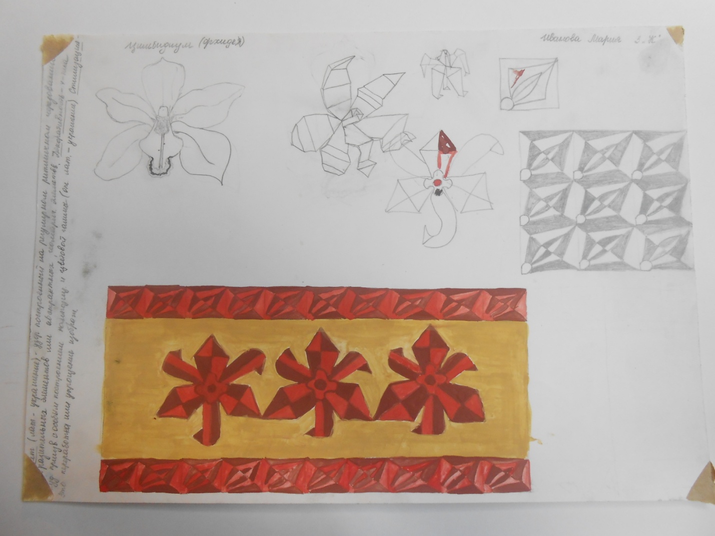
Summary of the lesson on the topic: "Stylization of plant forms in a ribbon ornament at the lessons of decorative composition."
Topic of the lesson : "Stylization of plant forms in a striped ornament"
Lesson objectives:
Educational: acquaintstudentswith the peculiarities of stylization of plant forms, to reveal the concept of "stylization", to tell everything about the ornament, its types. Mastering stylization as a way of translating the external forms of plants into ornamental motifs.
Organization of a ribbon ornament consisting of floral motifs obtained in the process of stylization.
Developing: promotethe development of creative thinking and enable its implementation by creating conditions in the classroom for choosing a creative solution to your composition of a plant motif,expanding the horizons and knowledge of students in the field of decorative composition.
Educational: to instill in students a sense of love for art, to form a sense of composition, to instill accuracy in the performance of work.
Tasks:
1. Fix the concept of "ornament".
2. Give the concept of styling.
3. To study the structure of plant forms.
4. To teach the stylization of these plant forms using the means of graphic expression.
5. Fix the concepts of symmetry, asymmetry.
6. Development of a sense of rhythm.
Methods: verbal, visual,practical.
Stages of work:
1. Analyze the structure of this plant form (in what geometric shapes it can be represented in the image).
2. Stylize this plant form using graphic expression:
Create a linear image of an ornamental motif, based on geometric elements (figures).
Create an image of an ornamental motif based on a spot.
3. Using the resulting image, create a floral motif that will be a rapport for a ribbon ornament (work on a sketch).
4. Enlarge the image of the ornament. The ornament should be limited to 2-3 repeating plant motifs (rapports).
5. Make an image of the ornament in color.
Course progress.
Reporting the topic, discussing the purpose of the lesson. So,todaythe topic of our lesson: " Stylization of plant forms in a ribbon ornament".
The purpose of the lesson is to get acquainted with the peculiarities of stylization of plant forms and apply the knowledge gained in practice. First, we will remember what an ornament is and its types, and then we will move on to stylization. Ornament is decoration.The origin of the ornament is not known for certain. The emergence of the ornament has its roots deep into the centuries. An ornament is a reliable sign that a work belongs to a certain time, people, country.
An ornament is a pattern built on the rhythmic repetition of geometric elements - plant, animal motifs, etc., designed to decorate a variety of things (household items, furniture, clothing, weapons, architecture).
Depending on the motif, ornaments are divided: geometric, floral, animal, anthropomorphic, etc. We will consider a floral ornament. Plant ornaments are based on plants that actually exist in nature: flowers, foliage, fruits, etc. By composition, ornaments are divided into several types: in a strip (what we will do with you), in a square, in a rectangle, in a circle. Based on this, three types of ornament are distinguished: linear, cellular, closed.
Linear ornaments are ornaments in a strip with a linear alternation of the motif.
Cellular ornaments are a motif that repeats both vertically and horizontally. This ornament is endless in all directions.
Closed ornaments are arranged in a rectangle, square, circle.
Looking at all these ornaments, we notice that the natural form, by the power of imagination with the help of conditional lines, spots, turns into something new. We guess the plant, although it is still not the same as in nature. The existing form is simplified to the limit-generalized geometric form. This allows you to repeat the motif of the ornament many times without any extra effort. What was lost by the natural form during simplification and generalization led to the flatness of the image. This is what stylization is - a decorative generalization, simplification, flattening of the depicted objects, by changing the shape and color.
How do natural forms turn into ornamental motifs? First, a sketch is made from nature. Further - reincarnation - the transition from a sketch to a conditional form. It is necessary to simplify, decompose the image into simple geometric shapes. This is a transformation, a stylization of a motif. Stylization implies a distraction from non-essential features, focusing on more significant features that convey the essence (eg prickly thistle). From one sketch, you can create different ornaments. Then, repeating the motif, your own unique ornament is created.
Preliminary sketch work is a very important stage in creating a drawing of a stylized composition. The work in the lesson is carried out in two stages: in the first, students make a sketch from nature, and in the second, they translate it into a geometric form. This plant should be recognizable.
After the ornament is fully depicted, we begin to think about color. Color is one of the important means in ornamentation and is closely related to composition. Color combinations can be rhythmically repeated. as well as form elements. They can be sharp, contrasting or soft. Contrasting combinations are created by using colors of different lightness and saturation. The greatest contrast is created by combining black with light colors. A softer combination creates a connection with gray. Complementary colors, warm and cold shades are sharply separated by contrast. The softness of the colors is achieved by colors taken in different tonalities. Colorful combinations can be created with different shades of the same color.

1. An example of how to translate a sketch of a flower from nature into a stylized geometric shape, at a lesson in decorative composition, without violating the image of this plant.
The silhouette should fit into simple geometric shapes.
When developing an ornamental motif, it is advisable to turn the volumetric-spatial form into a planar one. If you need a three-dimensional image, be sure to use generalizations, conventions.

2. An example of a Trandoon flower, stylized in different shapes, in a decorative composition lesson. It is important not just to sketch what you see, but to find a rhythm and interesting groupings of forms (stems, leaves), making a selection of visibledetailsin the environment depicted on the sheet.
One and the same motive can be transformed in different ways: close to nature or in the form of a hint of it,associative; however, any plant should not be deprived of recognition during stylization (demonstrative material - photographs and drawings with examples of stylization of plants).

When working onmotif sketches (flower.) it is necessary to pay attention to its characteristic, most striking features, abandoning secondary details. At the same time, the features of the flower can be maximally exaggerated and brought to the iconic level.
How can you change the shape of an object? For example, if the bell has an elongated shape, it can be extended more actively, and a dandelion flower, close in shape to a circle, can be rounded as much as possible.
It is also important to pay attention to the angle of the depicted object. Atstatic composition it is advisable to avoid three-quarter turns, and use a top or side view, placing the motif along the vertical or horizontal axes.
ATdynamic composition it is wiser to use angles and slopes.
The color and color of the ornamental composition is also subject to transformation. It can be conditional, completely abstracted from the natural version.
Children's work made in the lessons of composition.


"Ornament composition" - Rules for constructing an ornamental composition. Rhythmic construction of an ornamental composition. Axial symmetry. The ability of the artist to abstract thinking. Composition. Chess rhythmic system. Ornamental composition. Symmetry types. asymmetrical arrangement. Structural elements of the ornament.
"Ornaments and patterns" - Oriental ornaments. zoomorphic ornament. Russian folk costume. Scarves from Pavlovsky Posad. Golden Khokhloma. The main eras of the development of the ornament. Renaissance. Geometric ornament. Zhostovo trays. Questions to review. The nature of the composition on the decorated surface. main motives. XVII-XVIII centuries (Europe).
"Ornaments of peoples" - Zoomorphic ornament. Oriental ornaments. Khanty and Mansi ornaments. Matryoshka. The ancient art of rangoli. Ornament on scarves. Ornament on fabrics. Alternation. Indian ornament. Small border patterns. Ornament. Types of ornaments. The location of the elements of the ornament on the fabric. Kazakh ornament. Ornaments of the East.
"Beautiful ornaments" - Turkmenistan. Ornaments in dishes. China. Patterns and ornaments. Application of the ornament. The source of the creation of the ornament was nature. What are the ornaments. Different countries give ornaments their own meaning. Arabs. Symmetrical ornament. Borders. Ornaments of the peoples of the world. Ornament. Mongolia Kazakhstan. Ornaments in architecture.
"Ornament" Turkish cucumber "" - Persian cypress. Oriental motifs in the Russian national pattern. Tear of Allah. Turkish cucumber motif in design. "Turkish cucumber" has gained popularity in Russia. Motives of "Turkish cucumber" in Russia. Persia is considered the birthplace of the ornament. A circle. Palette "Turkish cucumber". Painting sequence.
"Classification of ornaments" - Origin. The content of the subject ornament. Symbolic ornament. Geometric ornament. Epigraphic (calligraphic) ornament. Floral ornament. Classification of ornaments. Motives. Animal ornament. Types of ornament. Landscape ornament. Fantastic ornament.
There are 12 presentations in total in the topic
For the first time, the State Historical Museum presented a unique collection of beadwork from the first half of the 19th century, the time when this art flourished. Also there you can see objects of arts and crafts and fine arts with floral motifs.
Two halls are open for visitors. The first reflects an appeal to floral motifs - floral ornaments, forms stylized as plants or flowers. Here are the personal belongings of Empress Alexandra Feodorovna: diaries with flower sketches, a herbarium, and letters.
This part of the exposition also contains magazines and manuals that demonstrate the popularity of such a phenomenon as the language of flowers. A video is being broadcast in the hall, the material for which was the poems and poems of Delisle, Zhukovsky, Pushkin, Karamzin. These works reflect the language of flowers and flower symbolism.
.jpg)
.jpg)
The second hall, built on the principle of complicating compositions, consists of several sections. The first reveals the meanings of individual plants, flowers and the use of these meanings in arts and crafts.
You can see items with encrypted floral messages in bouquets and wreaths in the second section. The third exhibits objects of decorative and applied art, the design of which uses a combination of colors and various attributes that complement floral meanings. And in the fourth - plants and mythological characters.
The exposition also includes the works of modern jewelers, which are based on the traditions of art of the 19th century. In addition, items from private collections are shown for the first time.
Ministry of Education and Science of the Russian Federation
Federal Agency for Education
State educational institution of higher professional education
“Tobolsk Social and Pedagogical Academy named after V.I. DI. Mendeleev"
Artistic and graphic faculty
Department of Design and HO
Coursework on the topic:
Stylization of plant motifs in the execution of the artistic panel "Flowers"
Tobolsk - 2010
Introduction
The language of fine arts is multifaceted and diverse. One of the techniques used by fine arts is stylization. Stylization is a convention of an expressive language that is achieved by generalization, the purpose of which is to make an object more expressive. Each material dictates its own way of styling.
In the process of working on a work, and in particular on a decorative panel, artists resort to using such a technique as stylization, which allows not only to achieve expressiveness in the color composition, but also to emphasize the artistic image. Not only arts and crafts appeal to stylization, but also easel artists - Matisse, Klimt, Jacks of Diamonds, World of Art, Gauguin, Andy Warhol and many others.
Plant motifs are often found in the work of many artists. The image of plant elements in a composition can be stylized in different ways, the range of options for creative understanding of the objective world by the artist is different - from a light stroke of contours with a line to a complex tonal and color spatial form.
Based on the foregoing, the purpose of the course work was determined - using the techniques of stylization of plant motifs to create a decorative panel.
In the process of work, the following tasks were solved:
Consider the concept of stylization, its types and methods of implementation;
Analyze the works of artists and identify the stylization techniques used
to identify the specifics of using stylization techniques in working on a plant motif;
to study the features of working on a composition in the technique of oil painting;
deepen knowledge in the field of constructing a composition from stylized motifs and the rhythmic organization of motifs;
Object of study: stylization as a technique for creating a work of art.
Subject of study: features of the development of a decorative panel based on the stylization of color and form of a plant motif.
The following research methods played an important role in our work:
artistic analysis of a work of art,
method of stylistic analysis,
comparative historical analysis.
In the course of our work, we relied on the following sources. G.M. Logvinenko "Decorative composition", which introduces the basic principles of organizing a decorative composition, the properties of colors and options for creating color harmonies, methods and techniques of stylization. In the book of E.V. Shorokhov "Fundamentals of Composition", the theoretical and practical issues of the composition course are outlined. The author comprehensively examines the basic laws of composition in various types and genres of fine art, including monumental art.
The issues of the technique of the process of working with pictorial materials are considered in the textbook "Painting", which sets out the basics of the theory, methodology and practice of pictorial representation.
Chapter 1. Stylization as a means of creating the expressiveness of a work
.1 Stylization techniques in works of art
Stylization is a decorative generalization and highlighting of the characteristic features of objects using a number of conditional techniques. You can simplify or complicate the shape, color, details of the object, and also refuse to transfer the volume. However, simplifying the form does not mean impoverishing it at all, simplifying means emphasizing the expressive sides, omitting minor details. Stylization is a necessary and natural method in decorative art, posters, monumental painting, silhouette graphics, applied graphics and other art forms that require a decorative rhythmic organization of the whole.
Styling can be based on various principles.
The main visual characteristic of the depicted object can be the shape of the object, its outline, silhouette, contour. Extreme simplification, laconization of the form and the use of a certain image style will be one of the styling methods. In the process of generalizing the form, the artist, while retaining plastic expressiveness, singles out the main and typical, refusing minor details.
The first stylization technique is the simplification of color relationships. All shades observed in real form, as a rule, are reduced to a few colors. A complete rejection of the real color is also possible. Simplification of tonal and color relationships, sometimes reducing them to a minimum, to two or three tones, is another condition for styling (Appendix 1, Fig. 1)
You can change the quantitative composition of tones and colors, refusing some, you can additionally introduce new colors.
Simplification or rejection of the volumetric form of objects, by switching to a conditional planar applicative interpretation, involves a free interpretation of color lightness ratios, the search for new color palettes of colors, except in cases where the task involves preserving the color unity of objects or composition.
The next stylization technique is the rhythmic organization of the whole. Under the rhythmic organization of the whole is understood, first of all, bringing the form or design of the depicted object to a certain geometric, ornamental or plastic configuration. Symbolic images have a different rhythmic organization. Sometimes the ornamental, subject, plot images themselves are symbols or a system of symbols. In symbolic images, lines and spots can turn into more complex combinations, devoid of a specific narrative meaning. Then there are stylized images of a geometric nature. They may retain the plot basis, but the emphasis will be on the strict alternation of elements and their color combinations or the unconditional adherence to some geometric form. (Appendix 1, Fig. 2)
On the other hand, the fundamental principle of any geometric form is some kind of real-life form, generalized and simplified to the limits.
The process of transforming real images of nature into stylized ones is complex in nature, it is sometimes associated with the active transformation and deformation of the object, with its hyperbolization or complete rejection of individual properties of nature. At the same time, a stylized image is capable of reflecting the objective forms of nature in its own way, selecting the most typical and characteristic, retelling it metaphorically and thereby giving it a fundamentally new figurative content. (Appendix 2, Fig. 1)
There is a stylization method in which the basis is the decorative form of the depicted object, found through an expressive contour or silhouette filled with ornamental elements. This form can be found in various ways: first, on the basis of the natural properties inherent in the object (color, texture, etc.); secondly, on the basis of the depicted properties: subject (flowers, leaves), geometric (lines, squares) and a combination of both. (Appendix 2, Figure 2)
Transforming the natural form into a stylized motif, one must first find a plastic image of the motif that is convincing in its artistic expressiveness. In fact, any transformation of reality is carried out in order to identify new aesthetic criteria.
The surrounding world is largely rhythmic, ornamental. This can be traced by considering the arrangement of leaves on a branch, veins on a leaf, rushing clouds, tree bark, and so on. It is important to capture the most characteristic in the plastic form of the observed motif and to realize the natural connection of elements in the natural pattern.
It is thanks to the different rhythmic movements of the motifs, as well as the elements within each motif, that the artist is able to distinguish one motif from another. The artist follows the path of generalization of plant forms, striving to reveal the most important, the most characteristic.
Speaking of ornamentality, one should not forget about the plastic form of motifs, about the beauty and expressiveness of the lines that draw this form. Generalizing the form, it is not always necessary to abandon small details, as they can give the silhouette of the form more decorative and expressiveness.
In the process of stylization, such means of artistic expression as line, spot, color play an important role.
In the work on the stylization of motifs, a special role belongs to the linear drawing, since the line most sharply conveys all the nuances of the plastic form, the features of the transitions of one element to another, the rhythmic movement of these elements. However, some parsimony of a linear language can lead to dryness and even to schematism.
With a linear interpretation of the motive, three solutions are distinguished:
the use of thin lines of the same thickness;
the use of thick lines of the same thickness (if the drawing needs to be given activity, tension, monumentality);
the use of lines of different thicknesses. Such a solution has great visual and expressive possibilities, but is rather difficult. To achieve integrity, lines of one thickness must be combined, forming their own pattern in the composition, which must resist the pattern of lines of another thickness. More precisely, it should be a composition of lilies of different thicknesses. (Appendix 3, Fig. 1,2,3)
Spot stylization of motifs contributes to the maximum silhouette generalization of forms. It can be a black silhouette on a white background and a white silhouette on a black background. The artistic language of the spot is strict and restrained. However, the spot can also reveal an infinite variety of states. (Annex 4)
The most widely used is the linear-spot interpretation of motifs. In this case, it is very important to organize spots and lines into a harmonious composition. It is important to structure the spots into a single composition, interesting in itself, in rhythm and silhouette. It is also necessary to logically and harmoniously connect the lines with rhythmically scattered spots so that both of them, when combined, create a holistic graphic image. It is worth noting that the spot can be used as a lining for the linear solution of the motif. (Annex 5)
Considering the features of the stylization of forms, it should be noted that the color and color of the motifs are subject to artistic transformation, and sometimes to a radical rethinking. Not always the natural color of an object can be used in a stylized composition. The chosen motive can be solved in a conditional color, in a pre-selected color scheme, in a combination of related or related-contrasting colors. It is in this case that it acquires the conventionality characteristic of stylization.
1.2 Floral motifs in art
Flowers - a symbol of spring, the personification of the brightest and purest on earth, were sung in hoary antiquity. Artists have always been able to rejoice and be surprised at flowers. In ancient Egypt, temple columns were made in the form of bunches of lotus or papyrus, and the capitals were made in the form of ready-made painted buds. Ancient Chinese and Japanese scrolls have brought alive colors of peonies, wisteria, lilies to our days. If there were no flowers, arts and crafts would be infinitely impoverished. (Appendix 6, Fig. 1, 2)
Russian art has repeatedly turned to floral motifs. Artists of various creative aspirations addressed this topic. So, I.I. Levitan, being mainly a landscape painter, paid attention to flower still life.
In the compositions of the master, productions consisting of a large number of flowers were common. Levitan attached great importance to the painting of colors in mastering color and color relationships. Composition "Spring. White Lilac" is interesting in terms of technology and color scheme. Pastel with its velvety texture and, in particular, the method of laying large color planes, on which a different color is applied from above with pencil strokes, as it were, a glazing of a different color - this technique made it easier for Levitan to generalize the forms and link them together. This achieved a more still-life and decorative solution to the motif of a bouquet of lilac flowers in a pot. We find all this in an even more developed form in the still lifes "Cornflowers Bouquet" and "Coleus". (Appendix 7, Fig.1,2)
In Russia in the 90s. 19th century many artists K. Korovin, Z.E. Serebryakova, V.A. Serov, A.Ya. Golovin, N.E. Grabar turned to floral motifs. These artists create still lifes for a special analysis of color, form, decorative composition, rhythm; flatness appears in pictorial solutions.
The motive for K. Korovin to create works has always been a concrete reality, new and changeable at every moment. Therefore, for example, roses painted at different times - “Flowers and Fruits”, “Roses and Violets”, “Roses”, “Still Life. Roses”, each time they carry a reflection of the uniqueness of the moment, a new mood. But the master always does this - the glorification of joy, multicolor, the wealth of earthly life. The canvas "Flowers and Fruits", sparkling with the sun in every centimeter, is a true masterpiece of Russian impressionism. (Appendix 7, Fig. 3)
The master of theatrical and decorative art A. Golovin also addresses the theme of still life. In his still lifes "Porcelain and Flowers", "Girl and Porcelain", "Still Life. Phloxes”, the characteristic handwriting of the master appeared - graphic, clear contouring, planar patterning, exquisite coloring of the image. The stroke is deliberately linear. In this decorative manner, marked by the influence of Art Nouveau, floral compositions reminiscent of tapestries were solved.
Golovin's still lifes are distinguished by exquisite splendor. This was also reflected in the artist's penchant for decorativeness. (Appendix 8, Fig. 1)
During his long creative life, Saryan painted many beautiful paintings. He surprisingly penetratingly, lyrically and truthfully conveyed the majestic beauty and originality of the surrounding life and nature. He created images full of jubilant joy, revealed to people the world - kind, generous, sunny.
"Verbiose", spatial and close to nature still lifes. Instead of a few objects carefully selected in terms of shapes and colors, the originality of each of which is emphasized by a neutral background, as was the case in Grapes, the artist fills the canvas with many things, flowers, fruits, enjoying this abundance.
Many of Saryan's works belong to the peaks of his art, combining the strength and energy of the brush with the subtlety and complexity of expression. (Appendix 8, Fig. 2)
Saryan's coloristic searches led the artist to the theme of still life. This genre gave the artist great freedom in handling forms and colors, allowing them to be combined in any combination.
Lyricism and amazing picturesqueness are characteristic of S. Gerasimov's still lifes.
“I love my native land so much that everything that is connected with it, that lives and grows on it is dear to me ...” - this is what Gerasimov said, and these words can equally be attributed to his magnificent still lifes. They easily trace the traditions that underlie the art of the master. The best still lifes of the artist are characterized by vivid picturesqueness. At the same time, it is impossible not to see a direct difference between the rough painting of Gerasimov and the poetic creations of A. Arkhipov or K. Korovin.
Written with wide textured strokes, Gerasimov's still lifes well convey the juiciness of green leaves, the elegant brightness of flowers, all this with visible materiality, however, depriving nature of quivering poetry. Undoubtedly, the best works of Gerasimov include a large “picture”, “landscape-still life” composition “After the Rain” (“Wet Terrace”). This work successfully embodied the painter's interest in landscape, still life and interior. As can be seen from the memoirs of the artist's sister, he, literally shocked by the view of the garden after a stormy, torrential rain, painted the picture "with lightning speed" - within three hours.
Written under the impression that completely captured its creator, "Wet Terrace", however, does not seem like an etude that captures a vivid, but fleeting state of nature. This is a completely finished picture, distinguished by the integrity and generalization of the artistic image. Her composition, full of dynamics, is marked, however, by strict thoughtfulness. Behind the table, moved to the entrance to the terrace, the depth of the old garden opens. Wet floor boards shine brightly, heavy raindrops sparkle on the lush greenery of the bushes, on the petals of peonies in a glass jug, on the edges of a glass overturned by rain. The clouds have not yet dispersed, and therefore everything in nature, refreshed by a generous summer shower, is painted in cold and pure silvery tones. The combination of cold and sonorous colors in which the “Wet Terrace” was performed allowed Gerasimov to express his admiration for the wealth and beauty of the world, to create a joyful mood, which the painter generously shares with the audience. In another still life - "Roses" - one can see the influence of K. Korovin, Gerasimov's appeal to certain methods of his painting. This is felt not only in the choice of plot, but also in the "deepening" of the space of the picture by including a mirror in the composition, in the overall fragmentation of the still life.
The artist has an excellent command of color - the most important expressive means of painting, and in this still life you can feel it well in the way he paints transparent greenery outside the window or dark dense rose leaves. And the roses themselves, which only shades of red are not in their image - from pale pink to deep purple. How diverse the painter's still lifes were is evidenced by his paintings "Gifts of Autumn", "Bouquet" and others. (Appendix 8, Fig. 3)
Color, its expressiveness, a generalized interpretation of form - this is the language of these artists of the 20th century. In them, the boundaries of still life as a pictorial genre are extraordinarily expanding. In a still life, one feels not only the specifics of the way of life, but also those unique features that are inherent in a certain individuality.
With the richness of forms and colors, the concept of beauty in still life has become more diverse.
Flowers, it would seem, are not at all difficult to write, but this impression is deceptive. Flowers will help develop taste, master professional literacy, give an understanding of the laws of form, chiaroscuro, color. “A flower cannot be painted “so-so,” says Konchalovsky, with simple strokes, it must be studied, and as deeply as everything else.” Flowers are the great teachers of artists: in order to comprehend and disassemble the structure of a rose, one must put in no less work than in studying a human face. Roses have everything that exists in nature, only in more refined and complex forms, and in each flower, and especially in a bouquet of wild flowers, you need to understand it like in some forest thicket, until you catch the logic of construction, deduce laws from combinations, seemingly random.
Flowers can be painted and painted all year round. In winter - indoor, and in March and April snowdrops. Then the yellow lights of marigolds, kupavnets, dandelions light up. Not everyone prefers luxurious roses, lush peonies and dahlias, exquisite gladioli. I. Shishkin, I. Levitan, S. Polenov most often depicted modest forest and wild flowers - cornflowers, daisies, dandelions.
Some people like huge, colorful bouquets, others like small, just a few plants.
The life of nature in art is reincarnated into artistic images and becomes interesting not only in itself, but also as an image of life processes interpreted by the artist, as his attitude to reality. In this regard, mediated by the worldview and worldview of the individual, the author's judgment about reality is expressed, the artistic intention is realized.
Flowers for artists are strict examiners. By the way he sees them, how he treats them, how he portrays, one can judge his attitude towards people, nature, life.
1.3 Stylization techniques in the works of artists
Art has been addressing the techniques of stylization since time immemorial. Even in primitive times, people turned to this technique by making rock paintings.
We see the technique of stylization in the work of many major Russian and foreign artists.
For example, Gustav Klimt widely uses ornamental stylization and color stylization in his works. (Appendix 9, Fig. 1). Henri Matisse gives more preference to the stylization of color. (Appendix 9, Figure 2)
In the works of Fernand Leger, we see the figures of people stylized linearly. (Appendix 9, Figure 3)
The works of avant-garde artists Piet Mondrian and Pablo Picasso are based on the principles and techniques of stylization.
No less widely stylization techniques are used to create a floral still life.
This genre is the most consistent with the stormy temperament of Cezanne. In his studio, he could, with tireless diligence, rearrange apples, dishes and plates, vases of flowers, until he found a subject that satisfied him. Cezanne spent weeks, and often months, working on his still lifes.
So, for example, the composition "Blue Vase" bears traces of the influence of the Impressionists, which contributed to the clarification of Cezanne's palette in the 70s. Over the still life "Vase of Flowers", the work of 1903, Cezanne worked for more than a year and, despite the fact that he looks quite finished, he considered him unfinished. (Appendix 10, Fig. 1)
For the first time, the post-impressionists P. Gauguin and Van Gogh in a flower still life appeared intense color combinations, a graphic contour outlining colored planes. But decorativeness was not yet the main goal of these artists.
This is how Paul Gauguin addressed this genre. "Still Life with Japanese Peonies in a Vase and a Mandolin" is exquisite in color and finely thought out in composition. The artist chose this particular vase for its intense color painting, which harmonizes with the deep blue of the wall in the background, while the shimmering colors of the bouquet - white, red and green, are combined with the tones of the painting hanging on the wall. The artist also achieved harmony in the interaction of forms: the rounded outlines of objects correspond to the shape of the round table on which they are placed. The choice of subjects corresponded not only to formal, but also to conceptual tasks. The mandolin can be taken as a symbol of the harmony that Gauguin sought in the relationship of form and color, while the vase and dish testify to the artist's interest in stylization in the art of ornamentation. (Appendix 10, Fig. 2)
Vincent van Gogh, a Dutch painter, also said his word in the pictorial solution of a still life, solved in light, pure blue, golden yellow, red tones, and dynamic, as if flowing strokes, characteristic of him. The dynamics of color and stroke fills the master's still lifes, such as "Sunflowers" and "Irises", with spiritual life and inner movement. (Appendix 10, Fig. 3)
In the 20th century, Henri Matisse turned to the theme of still life in European painting, who is also no stranger to floral themes.
The most expressive still lifes of Matisse are written in Seville, in a hotel room, "Seville Still Life" and "Spanish Still Life". The flowery ornaments of the Spanish shawls are matched with the patterns of the upholstery of the sofa. The flowers on the table turn into a fabric pattern, and the fabrics painted with flowers and arabesques roll over the bouquet in colorful waves. The decorative painting of Matisse reaches new heights in these still lifes. “This has been my favorite painting for many years,” Matisse says of Still Life with Magnolias. He painted this composition in detail, object after object, color after color, consisting of red, black, yellow ocher, white, medium cadmium yellow, superimposed on the glazing with scarlet varnish. (Appendix 10, Fig. 4)
Thus, based on the foregoing, we can say that the theme of flowers and floral still life remained the subject of interest for many artists of different times and styles, where they could use stylization techniques. In the process of work, the masters raised questions not only of the subject environment, but also of its pictorial and plastic solution.
Chapter 2
.1 Composite solution of a decorative panel
In the process of making sketches and sketches, the most interesting compositional solution is selected.
All compositional work focuses on the placement of the floral motif within the picture plane.
Flowers should not be arranged randomly or randomly. Each flower must be connected in meaning with another. It is very important to put them in such positions that will be most natural for them.
The size of the image of the entire group of colors must be in accordance with the background. Images of flowers should not be crowded on the plane, but the background should not prevail over the image. Objects should be arranged so that they do not block each other, well highlight their characteristic properties.
Horizontal and vertical format is more suitable for narrative composition. The close to square format gives the impression of visual stability. The vertical format evokes a feeling of aspiring loftiness, monumentality.
When working on a stylized floral motif, we used various principles and stylization techniques. The main visual characteristic of the depicted objects was the shape of the objects, their outlines, color and silhouette. We resorted to the ultimate simplification of the form of flowers, space, and abandoned the real color and simplified the tonal and color relationships.
In our work, we used such a stylization technique as bringing the shape of the depicted object to a certain geometric configuration.
Our type of composition can be defined as polychromatic, as it is dominated by more than four chromatic colors. A multicolor is a color composition in which four or more chromatic colors dominate. Usually, two main pairs, or four primary chromatic colors are used in multicolor: red, yellow, green, blue, as well as their shades.
To achieve expressiveness in a decorative composition, an important role is played by the rhythmic organization and interconnection of pictorial elements on the plane.
In the rhythmic organization of the motives of our composition, we used the method of rhythmic alternation of elements with a decrease or increase in certain qualities (size, turns, measure of complexity, color or tonal saturation, degree of graphic or decorative processing of the form). (Annex 11)
2.2 Characterization of the properties of oil paint
The seemingly endless variety of styles and painting techniques is not only due to the huge variety of life, but also due to the presence of an assortment of artistic materials. Depending on the product used, each color has its own characteristics that need to be disclosed and used; and, when different binders are used, these colors take on completely different personalities.
Our composition is made with oil paint. The advantages of this artistic material are undeniable, and it allows the artist to combine various techniques in a painting, such as “alla prima” and glazing, or turn to decorative painting.
Oil can be painted quickly, and landscapes, still lifes, portraits and complex compositions are created in such a painting technique that require long-term work using the glazing method. But at the same time, it is important to maintain freshness, not to “dry” it, to avoid blackness.
The properties of oil painting are reflected in the texture and the ability to work with a palette knife.
It is known what great importance was attached at all times to mastering the technique and technology of working with pictorial materials. Mastering professional techniques in painting, knowledge of the technology of working with pictorial materials and various techniques and methods of painting, the ability to apply this knowledge are necessary for the artist.
“Technique is the language of the artist; develop it relentlessly, to virtuosity. Without it, you will never be able to tell people your dreams, your experiences, the beauty you saw,” said P.P. Chistyakov.
There are several ways of conducting a pictorial sketch with oil paints: a multi-session or glazing method, a single-session method using the “a la prima” method. You can use a mixed technique: one part of the image is prescribed with multiple glazing, and the other part - using the “a la prima” method. The choice of the method of conducting work depends on the tasks set, and is also determined by the nature of the composition.
The “a la prima” method consists in the fact that after the found compositional solution of the staging and the preparatory drawing, the entire study is performed in one session. The color of each detail of the production is taken immediately in full force, i.e. Painting is done almost in one layer.
The advantage of the method lies in the fact that during the entire session the initial impression is preserved, which contributes to the bright, emotional coloring of the work. In addition, the method allows you to take color in painting at once in full force and conduct the entire study at the same time, adding color to an already laid stroke as necessary, without applying paint several times in one place.
Picturesque work, written in this way, is distinguished by freshness, depth of color.
The first pictorial layer denotes the dark parts of objects by color and tone. The second paint layer is applied over the dried work. It concretizes the form, enriches and refines color and tonal relationships.
Strokes are performed strictly according to the shape of objects. At this stage touches are specified. It is necessary to trace the places of clear, contrasting touches of the shape of objects with the background and other details, the places of soft combination of the contour of the object with the background, as well as the places where some details are immersed in a common shadow.
After the etude dries, the next layer saturates the color of the shadows, refines the shades of halftones, and refines the work on the forms of staging. The work is completed by bringing all the details of the production to an adequate color and tonal state, emphasizing the main, most interesting and characteristic qualities of the production and leveling the secondary ones.
When applying one paint layer to another, it is necessary to take into account the influence of the color of the first layer on the color of the next one. For example, blue over yellow produces green, red over yellow produces orange, and so on. Here, in addition to practical skills in painting, knowledge of the course of color science is necessary.
In our work, we used a mixture of various techniques.
2.3 Oil painting base
There are many primer recipes for canvas painting, but the best are primers whose components are related to paint binders.
For oil paint, as a primer, factory-made white can be used or prepared by mixing casein oil emulsion and dry zinc white.
N.V. Odnoralov offers a recipe for emulsion primer with pre-gluing. The sizing composition includes 7 parts of casein dissolved in 100 cubic centimeters of water, 9 parts of a 3% solution of borax, which improves the adhesive properties of casein. After the sizing has dried, an emulsion primer of a creamy consistency of the following composition is applied to the canvas (number of parts): casein - 200, borax - 9, linseed oil - 10, zinc white - 50-80, glycerin - 5, phenol - 0.1, water - 300 milliliters.
Canvases and cardboard coated with emulsion primer are produced by the production plant of the Artistic Fund of the Russian Federation. Before starting work, such canvas and cardboard must be primed with an additional thin layer of casein oil white, otherwise the paint may dry out. When priming a base for painting or coating an emulsion canvas with casein oil white, you should use a wide bristle flute, moving first in the direction of the warp threads, and then in the direction of the weft threads. You can start writing on primed canvases and cardboard only after the final drying of the primer or casein oil white. For our work, we used factory-made canvas.
There are also other primer recipes that are described in the specialized literature on painting techniques. For the preparation of tinted colored soils, the desired color of casein oil tempera is added to these soils.
Brushes, palette knives, palettes. For oil painting, flat and round bristle, kolinsky and squirrel brushes are used. To perform the work, we used flat bristle and kolinsky brushes of three sizes: large No. 28-30, medium No. 16-18, small No. 8-10.
Palette knives are used in painting as a tool for removing paint from the palette after work is completed, and also as a tool for working with paints instead of a brush. Paints mixed with a palette knife are distinguished by sonority and depth; painting with a palette knife allows you to get interesting textural effects on a painting surface. But to work with a palette knife, appropriate preparation is needed, since the fascination with external textural effects sometimes damages the artistic truth of nature. In our case, the palette knife was used to apply the main paint layer.
In our work, we used a multi-session method of working on a decorative composition.
The sequence of the image of the sketch in the technique of oil painting.
First stage. Performing a detailed drawing of the composition with thin lines, identifying the main proportional relationships of objects.
Second phase. Execution of underpainting. The first laying of local colors. The color of objects is compiled on a palette.
Third stage. Identification of color and tone relationships. Elaboration and refinement of details. Oil allows you to make changes in the work.
Fourth stage. Generalization and completion of the work. (Annex 12)
Conclusion
decorative panel stylization paint
The ability to see and understand harmony in life and art, to think creatively is very important when creating a stylized composition. Focusing on this thesis, we created our composition. In the process of work, we took into account the effect of the rules, techniques and means of stylization, for which we considered the works of Russian and European artists. The rules of the color-rhythmic organization of the composition were also taken into account,
While working on a decorative panel, we studied the features of working on a decorative composition using stylization techniques, deepened our knowledge in the field of building a color composition and the rhythmic organization of motifs, improved our knowledge, skills and abilities in the technology of working in the technique of acrylic painting.
When working on the composition, we used the technique of dividing the plane into parts, which was carried out by straight lines in several directions. We used the technique of rhythmic alternation of different colors with decreasing size, color saturation, and a certain degree of decorative processing of the form.
When teaching a certain type of painting with artistic paints, a novice painter must, first of all, become familiar with materials, tools, techniques and technology. Without knowledge of the specifics of various types of painting and professional handling of materials and tools, success in mastering the basics of pictorial literacy is impossible.
As a painting material, we chose oil paint, which has multifaceted color and plastic properties. It is these properties that are most attractive to novice artists mastering the skills of painting. In our work, we used such a technique “a la prima”, which made it possible to improve the skills of pictorial writing, to emphasize the texture of the paint layer in the composition.
The result of creative and research activities, in our opinion, was the achievement of the set goal, the solution of the tasks identified at the beginning of the work.
Those skills and knowledge, the experience and skills that were acquired and consolidated in the process of work, I think, will help in further creative activity.
List of sources used
1.Alexandrov, V.N. History of Russian art / V.N. Alexandrov. - Minsk: Harvest, 2004. .Alekhin, A.D. When the artist begins / A.D. Alekhin - M., 1993. .Trouble, G.V. Fundamentals of visual literacy: Drawing. Painting. Composition: A guide for artists. - Count. fak. ped. in-tov /G.V. Trouble - M .: Education, 1969. .Vizer, V.V. Picturesque writing. Color system in fine arts /V.V. Vizer - St. Petersburg: Peter, 2006. - 192s. .Volkov, A. Work on picturesque sketches /A. Volkov - M., 1984. .Volkov, N.N. Composition in painting / N.N. Volkov - M.: Enlightenment, 1977. .Volkov, N.N. Color in painting / A. Volkov - M., 1965. -170 p. .Dmitrieva, N.A. Brief history of arts. Issue 1-3 / N.A. Dmitrieva - M., 1969, 1989, 1992. .Girard K. Matisse. - M. 2001. .Ioganson, B.V. About painting /B.V. Ioganson - M., 1960. .History of Russian art: in 2 volumes. T. 2, book. 2. Textbook. - M., 1981. - 288 p. .Kiplik, D.I. Painting technique / D.I. Kiplik - M., 1999. - 203 p. .Kirtser, Yu.M. Drawing and painting: Proc. allowance. - 3rd ed. erased / Yu.M. Kirtser - M., 2000 - 271 p. .Kovtun E.F., Babanazarova M.M., Gazieva E.D. Vanguard stopped on the run. - L., 1989. .Kruglov, V.F. Korovin /V.F. Kruglov - St. Petersburg, 2000. .Logvinenko G.M. Decorative composition: textbook. Handbook for students of higher educational institutions. - M., 2004. - 144s. .Malevich: Artist and theorist: Collection of articles. - M., 1990. .Martiros Saryan. - M., 1974. .Mironova, L.N. Color in the visual arts. / L.N. Mironova. - Minsk, 2003. .Neklyudova, M.G. Traditions and innovation in Russian art of the late XIX - early XX century / M.G. Neklyudova - M., 1991. .Petrov, V. Isaac Ilyich Levitan / V. Petrov - St. Petersburg, 1992. .Pozharskaya, M. Alexander Golovin: The path of the artist. Artist and time / M. Pozharskaya. - M., 1990. - 264 p. .Pospelova, G.G. Essays on the history of art /G.G. Pospelova - M., 1987. .Sarabyanov, D.V. History of Russian art of the late XIX - early XX century / D.V. Sarabyanov - M.: Galart, 2001. .Saryan, M. From my life / M. Saryan. - M., 1990. - 304 p. .Sergei Gerasimov. - M.1974. .Sokolnikova, N. M. Visual arts: A textbook for uch. 5-8 cells: At 4 hours. Part 3. Fundamentals of composition / N.M. Sokolnikova - Obninsk: Title, 1999. - 80s. .Fedorov - Davydov, A.A. Early work of Levitan. //Art. - No. 8. - 1962. - p.51. .Harris N. Klimt. - M .: publishing house "Spica", 1995. .School of Fine Arts: Vol. 5 - M., 1994. - 200 p. .Shorokhov, E.V. Fundamentals of composition / E.V. Shorokhov - M.: Enlightenment, 1979. .Yuferova, N.A. Isaac Ilyich Levitan / N.A. Yuferova - L., 1962. .Yakovleva, N.A. Analysis and interpretation of a work of art. Artistic co-creation: Proc. Allowance / ed. ON THE. Yakovleva - M: Higher. school, 2005. - 551 p.
And we still need to tell a little more about the exhibition.
The State Historical Museum for the first time presents a unique collection of beaded works, as well as other objects of decorative, applied and fine arts of the first half of the 19th century. with floral and plant motifs and their symbols. The exhibition demonstrates about 100 exhibits, interesting in their history.
This is from the museum's website.
The exhibition is really very small. And all the exhibits are small, with the possible exception of a couple of vases and a beaded upholstery of a sofa. The moment when you have to walk and look. The labels are not very detailed, and works of art are read on the screen in the hall. (At the exhibition of interior drawings, the story of the album exhibited at the exhibition was told on the screen, it was very interesting).
And the exhibition is somewhat eclectic. I even had the impression that either there wasn’t enough bead work, or the museum’s strategy was to attract exhibits from other departments and other organizations, or for some other reason, but a number of exhibits, of course, contained images of leaves , flowers and so on, but somehow did not really fit into the context. Although, perhaps, I just did not delve a little into the exhibition itself. When you photograph the exhibits, you get carried away by each of them, as a result, you may not see the forest for the trees. And yet - this is already my ninth exhibition in a little over a year at the Historical, but almost all the past ones were “monographic”: chivalry, folk costume, Greek gold, Gambs furniture and so on. And at this exhibition, the exhibits are united by some kind of artistic connection with each other. Unusual! However, below I will give Prussian plaques, a glass, and two more letters from Empress Alexandra Feodorovna, the wife of Nicholas I, which obviously fell due to drawings on a piece of paper, even their text has not been translated.
About beadwork. I understand that the items presented at the exhibition - many - are woven from beads. More precisely, they are connected from beads. That is, there is no material, fabric or leather on which the beads would be sewn. If so, then this is a discovery for me, I did not know about such a technique.
All the exhibits below are just from two showcases of the exhibition, that is, not specially selected by me.
Beads, silk thread; knitting
GIM 70488 BIS-1084
Beads, silk thread; knitting
GIM 77419/33 BIS-1432

Beads, canvas, leather, copper alloy; embroidery, embossing, gilding, knurling
GIM 78112 BIS-1240

copper alloy; casting, gilding
GIM 68257/29 LU-6763; GIM 68257/47 LU-6764

A.P. Vershinin (author and painter)
Plant Bakhmetiev, Russia, Penza province., Gorodishchensky district, with. Nikolskoye, 1810s
Colorless crystal, milky glass; overlay, diamond cut, painting with silicate paints
GIM 61679/3 1771 Art.

6. Letter from Empress Alexandra Feodorovna. 1840
Letter from Empress Alexandra Feodorovna to her father, King Friedrich Wilhelm III of Prussia
Paper, ink
GA RF, F. 728, Op. 1, D. 829, Part III, L. 179


