French artist Xavier Collet explains how to make the painting process more efficient using the example of his work with a dark fairy surrounded by a forest.
I think the following drawing rules can help you develop your skills, but sometimes it can feel like they are trying to limit you. Trying to satisfy a wide range of artistic criteria such as character designs, thoughtful compositions, and effective color schemes can slow you down, but fast work isn't always good, so keep that in mind.
I believe that the best way to the top is to learn to feel, to do things instinctively. With practice, seeing things that are in the image and identifying those elements that still need to be worked on becomes second nature, fills the subconscious as you work.
With practice, it becomes second nature to see things that need improvement.
The only thing I did before I started drawing was to step away from everyone and the pictures in my head so that my subconscious mind would start generating ideas. After that, I completely immersed myself in the drawing process.
Initial sketches
I don't know how far I'm going to take this illustration. But I know that I want the main character to be a kind of queen - someone who will make you afraid, feel anxious, looking into her eyes.
So I'll start with a rough sketch to get an idea of what the composition will be. She walks in the forest and watches you. Well, let's start drawing someone who will make you feel real fear and bewitching horror.

Fifty Shades of Grey
It is important to take into account the depth of the image and determine the planes: a background with two or three levels of depth; your hero's main plane and foreground.
I start in mono - it's faster and it will be easier to change something. I chose a palette of many shades of gray and by adding horns and a full-length long dress to the character, I began to define her character.

A starting point
We all have our little weaknesses. Mine is that I can't resist drawing the character's face in the early stages. It's often said that detailing elements in isolation is not a good practice because you don't end up seeing the big picture.
Useful advice, I do not argue, but I cannot bear the fact that there will be only a few details on the face, my hands itch terribly to complete them. So I took some time to draw the face, crown, horns and hair.

Sometimes it is very difficult to determine what colors an illustration will be in. So here's a little tip for you. Take an old drawing or even a photograph, it doesn't matter. Duplicate the image layer and apply the Gaussian Blur effect to the duplicate. Then change Blending Options - Blending Mode - Overlay. And see if this color scheme inspires you for your working illustration.

Finding a Color Theme
After that I adjusted the Hue/Saturation and paint with the brush already in color mode. Another tip is to apply Auto Levels or Auto Contrast and then play around with the layer's blend modes. Sometimes happy accidents will inspire you and help you overcome the wall of "uncreativity".

Add details
I start drawing the details of the character, starting with the head and bust, before moving on to designing the clothes.
I'm not making any ideas about the dress like I said, I'm just scrolling through a large selection of various images so that my creativity gets fresh juices and I can come up with an unusual design for the dress.

Contrast
It is good if there is contrast in the picture. More specifically: the opposition of shapes, brightness and color. My choice for this illustration is a bluish light, which will indicate magical power and control over all living beings in this drawing.

More details
Now that I'm satisfied with my choice of colors, I can complete the design of her costume by adding details such as jewelry, and depicting a range of materials such as fur, leather, metal, glitter, which all together make the design more interesting.

Plastic surgery is your friend
Remember the benefits of digital graphics software. The Photoshop Liquify filter is a powerful editing option. Here in my illustration I'm using it to touch up the face of the fairy since I decided it was too long.

Finish with her
Time to finish the last details of the character. I added the finishing touches to her corset, painted a skull on her staff, added a blue glow to her costume, and so on.
And now it's time to spice up the background with some rays of light and some noise. The speckled brushes set to Dodge Color are perfect for me.

We create pets
I want my dark fairy to have... pets. The lower part of the composition is a little loose, so it's the perfect place to draw the creatures that come to life with her dark magic.
I don't have a clear idea of what I'm going to do, so I sketch with a dark brush and then use the brush set to Color Dodge to add details such as the eyes and mouths from which the wisps of magic come out.

Monster menagerie
So far, I'm working instinctively and I'm quite happy with the design of my creature. Now I can add others. I use the same workflow: I create a small sketch and then add details using a brush set to Color Dodge.

blurry elements
I am almost done with this illustration and now I will apply some of the tricks I have learned over the years of my work. I want my fairy to look at the observer - the viewer who is hiding in the forest.
So I paint the branches with hard brush strokes. There is no need to draw them in detail. Then I added a Gaussian Blur effect to them and that's it - they're done!

Grain adds texture
I love adding texture to my drawings. Sometimes it's just a paper texture created with Layer Overlay. But now I'm going to do something completely different.
I added a neutral gray layer (Saturation - 0, Brightness - 50) and applied Filter>Noises>Add Noise twice (set to maximum) and Filter>Blur>Blur three times. Then I set this layer to Overlay (Overlay) and clicked on the Opacity of the layer, setting the settings to 5-6%

More magical life
I decided that the painting needed more life. My solution is to quickly paint the butterflies in the foreground, again to give the drawing more depth.

The last trick
Last tip. An easy way to add a little more variety to your art is to create a new layer and fill it in with a soft cloudy brush.
Set the foreground color to light gray and use a soft cloudy brush to create contrast. Then put this layer in Overlay Mode.
I followed my own advice and finished the drawing!

You will see how I create a concept sketch, a background, and then gradually improve the image, drawing out the details. By the way, you can easily apply the techniques shown in this tutorial to your illustrations, logos, and other projects! Drawing lessons like this always seem to make the drawing process easier, but if you think you're not good enough at drawing, it's never a bad idea to just give it a try, as the goal of these lessons is to improve your skills anyway! I'm sure those of you who can't make scale drawings can start with quick sketches like this one.
I used the following tools:
- Photoshop CS3
- Wacom Graphire 3 USB Tablet (Blue)
Step 1 A: I started with a sketch. Then I painted the surface of the earth. Here, as you can see in the finished drawing, there is a lot of green grass and it reminds me of the old song: "Green Green Grass near the house." So try to imagine something like that. Perhaps here, not far from a small house, there is an old oak tree, in the shade of which you loved to play so much as a child. Once I decided on the scene, I began to think about the colors: the main and background shades. Here I tried to imagine a clear image. I started painting on a blank background, to which I added a few colors. I don't like to work with drawings, the background of which is simple and inexpressive. Adding different colors keeps the image interesting and also helps to set the right mood.
Step 2: I added details with a brush with a small diameter. For these illustrations, I only use the brushes that Photoshop already has by default. You can download other brushes if you like. Here are the brushes I used for this illustration. In my drawing, I will use only standard brushes. Before you start painting, you need to set up your brushes.

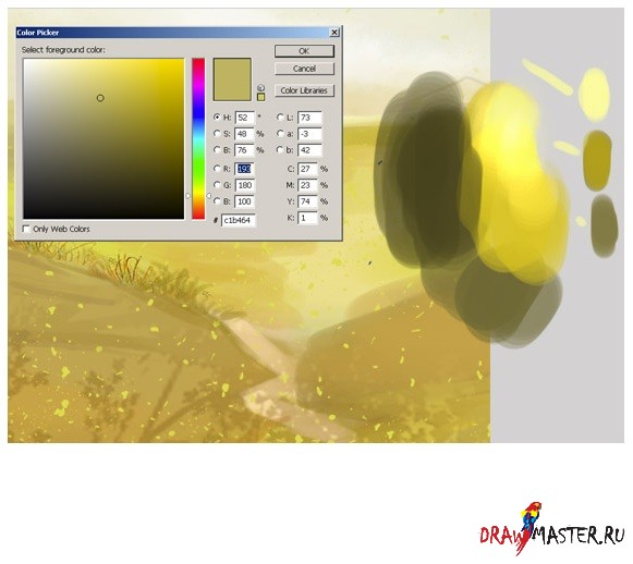
Step 3: Now you need to choose the main colors for your composition. And here are my colors for this illustration. As usual, I want to create a very bright drawing. For the background, I chose yellow and blue shades. All other colors are for the environment. Open another file and save your colors. And keep this new file always open while you draw.

Click on the image to view the image in full size and 100% quality.
Step 4: I decided to remove the old car that was at the house. She really doesn't fit in here. This car is not combined with the rest of the elements of the picture. So I had to erase the car and draw an old oak instead, you might want to draw some other tree. I made a rough sketch in color with a large diameter hard round brush, and then roughly painted the details with the same brush but with a smaller diameter. I also created a new layer for the grass and made a rough sketch.

Step 5: Then I started painting the green grass in more detail with a small hard round brush and smoothed out the image with a soft round brush...but later I can change this, for example, there may be reddish blue or yellow flowers. But for now, I think green grass is just the right thing.

Step 6: When I look for a suitable color, I do this:
Step 7: Now pay attention to how I paint the wood. In this tutorial, I do not show many types of wood. Only two types are presented here: one for the door, and the second for the fence.

Step 8: And now let me resize the canvas. As you can see, if you want to get a drawing with a lot of detail, then you will have to work on a large canvas (about 2000 or 2600 pixels).

Step 9: Add details using a small brush. Here, pay attention to how I draw the details of the roof.

Click on the image to view the image in full size and 100% quality.
Step 10 A: In the next steps, I'm going to create a few more layers for the green grass. The reason for creating multiple layers is that you will need to adjust the drawing later. It is much easier to correct mistakes if the main elements of your drawing are separate objects. I rough-painted the drawing with a large hard round brush, and then added details with the same brush, but with a smaller diameter. I also created a new layer for the hair and made a rough sketch. Returning to the question of how to draw grass. Just click on the brush icon, choose a different color and paint as shown in my sketches. Then just repeat the same action.

Step 11: Now it's time to start detailing the clouds. When drawing the clouds, I shaped them with white on separate layers, and then changed the layer's blending mode to Overlay (Overlay) so that this effect was noticeable in the picture. And I only used two layers for the clouds. One color - as a base, and the other - to increase the brightness of the background. Try to find balance by combining different brush shapes and try painting clouds with different strokes. You also need to define lights and shadows. Photos of the real sky will help you in this matter. Just search Google for different cloud shapes.

Step 12 A: I also wanted to add some bright sunlight and other details like a flash of lightning. After several attempts, I settled on the option that is shown in my drawing. At this point, it looked pretty close, but I'll get to that later. I should also note that each element of the drawing ended up on a separate layer, which allowed me to quickly select the desired object and change colors with ease. Press Command + Click (on Mac) or Control + Click (on Windows) on the layer icon in the "Layers" palette in order to select opacity (opacity).

Step 13: Settings. It is very important. You can choose the right color and thereby change the whole atmosphere. Now I'm using Color Balance. After that I changed the brightness and contrast. You will notice how the light effect changes.

findings:
Now it's time to close Photoshop. I hope you liked it! As a finishing touch, I add a Smart Sharpen filter to the flat drawing in order to get crisper, sharper lines. This helps bring out fine details such as highlights. I hope you enjoyed reading this tutorial.

Click on the image to view the image in full size and 100% quality.
Igor Volkov
29.01.2018 12:00
visibility 2023
Figured out how and with what to illustrate the text
Illustrations help draw attention to the article and highlight important thoughts of the author. If you pay enough attention to the illustrations and choose them correctly, the quality of the text will become much higher.
In this guide, we'll cover:
What are illustrations, their functions and role in the text
Types of illustrations, where to find them and how to use them correctly
Principles of illustration: do's and don'ts
The instruction will be useful to everyone who works with texts - journalists, copywriters, editors.
Why illustrations are needed
An illustration is an information object that complements and reveals the thoughts of the text. In one of seminars Maxim Ilyakhov says they are not always represented by images. A little further we will analyze what other types of illustrations there are, in addition to pictures.
Illustrations perform four important functions.
Increase reader engagement. Illustrations make the text visually structured and easy to read. An article with pictures looks solid and attracts attention, while a bare sheet of text scares and alerts.
The blog.hubspot website has detailed statistics demonstrating the benefits of visual content. One metric reports that people are 328% more engaged with content with pictures than with the same text without pictures.
Compare for yourself:
328% this increases the reader's involvement in an article with pictures
For many texts, this is the main type of illustration. Whether we are writing about a product, talking about current events, or describing specific objects in the real world, photography is indispensable.Try not to use boring photos from the search results, they have already been taken millions of times. It is better to spend time and prepare the photographic material yourself. Well, or at least look for a picture on the Internet more carefully. Photo stocks are not always bad, sometimes you can find a good illustration in them.
Photo from one of the free photo stocks. Could be a great illustration for an article about street art
Where to get. Ideal for photography. Illustrating an article with your own photos or requesting them from a client is much better than looking for suitable images on the Internet.
Free photo stocks. Sometimes you can find something decent.
INFOGRAPHICS
Infographic example: how much water is spent on the production of various products
In what cases to use. Infographics make complex information easier to understand and easier to remember. Use it if you need to explain difficult facts in the most accessible and simple way, to illustrate the principle of operation or the device of something.
In what cases to use. Ideal for data visualization if the text contains statistics, measurements and other numerical indicators. They clearly illustrate numerical information and show the relationship between quantities.
Where to get. The main tool for creating graphs and charts is Excel. You can also use other free services:
In what cases to use. Suitable when you need to show something in motion. Or more visually and with sound to present the product, show the process of work. In a word, videos, like photos, will fit almost any text.
Where to get. The best option is to record the video yourself or ask the client to do it. You can also look at video hosting sites. In addition to YouTube, check out the following resources:
Avoid overly glossy illustrations. In an article on how to write a blog for habr, Sergey Abdulmanov says that people trust handicraft and realistic illustrations more:
“The best picture possible is how you and the installer kick the server box in a dim basement. Or like a rat stuck in a fan. Or shooting a specific chip (connector, cable or other part related to the post) with a caption what it is. In general, the picture should either be beautiful technically and visually, or be as eye-catching as possible. Because vyryglaznost shows that all this is real.
Don't overload
If illustrations are more important than text in the material, then a lot of pictures are justified. For example, in a recipe for cooking. When illustrations play a supporting role, it is better to keep a balance, otherwise the text will be uncomfortable to read.
Signs of a good illustration:
Truthfulness. The illustration must be lifelike. People instantly recognize a fake when they see smiling people in suits or pictures with a MacBook turned off. An English-language article on the contentmarketinginstitute.com blog talks about how photos of people from photo stocks instead of real employees undermine the credibility of the text and the company.
Concreteness. If the text talks about how to make a cherry pie, then the illustrations should show the process of making a cherry pie. Do not draw comics on abstract topics.
Clarity. The reader must clearly understand what the illustration tells him. It should be extremely accessible and understandable.
Briefly about the main
The four functions of illustration are to increase engagement in the text, reveal important thoughts, influence emotions, and communicate the topic and nature of the article.
The illustrations reveal and complement the thoughts of the author.
Illustrate only the most important.
Types of illustrations: photographs, drawings, text, diagrams and graphs, video, gif animation, diagrams, interactive.
Be careful with borrowing other people's illustrations - you can violate copyright.
Sign illustrations.
Avoid cheap and low-quality illustrations. Don't forget about layout.
The illustration must be specific, truthful and understandable. If the topic is abstract, use metaphors.
Where do you usually get illustrations for texts? What resources and services do you use? Write your thoughts, ask questions about illustration. We will definitely add the most interesting ideas to the article.
Tags: | |The illustrations in the book are an important emotional factor influencing the reader of fiction, which has an aesthetic and semantic impact. Illustrations contribute to a better perception of texts of any level of complexity, helping to make a choice in favor of a particular publication!
In this article, we will introduce you to the main points of illustration and tell you how to do it. You just have to choose the appropriate way to design your book with illustrations.
The size, format, and arrangement of each illustration in a book has a purpose. You need to get familiar with how illustrations are usually posted and drawing techniques in order to communicate with illustrators in "the same language".
There are the following types of illustrations:
- Frontispiece. Such an illustration for a book is printed on a separate thick sheet of paper and glued to the left side of the first book block, the spread of the title page before the first page of the text material. As a rule, this sheet displays the main idea, the action of the story. In some cases, a portrait of the writer or the main character of the plot of the work is located here.
- Screensaver. It is used to decorate the beginning of a chapter or section, and reproduces the thematic transcript of the content of the entire rubric part of the publication, this is a kind of graphic introduction. The screensaver prepares the reader for the development of the plot, the emotional perception of the work. In addition to thematic pictures, an ornamental, symbolic, object-decorative thematic composition, called a ruler, is often used at the beginning of sections.
- Strip. A drawing that occupies the entire page of a book.
- Half-band. An image that is located anywhere on the page: top, bottom, right or left.
- On the turn. The image that occupies the spread of the publication.
- Defense. Thematic image framed by text.
- Drawings in the fields. Small images spread around the edge of the text strip.
- Background. Often used in color gift editions. The text is placed on top of the image.
- Ending or vignette. A drawing or graphic element is placed at the end of the text. It is performed in one plot-thematic performance with a screensaver.
The following are the main drawing techniques:
- pencil or charcoal;
- watercolor or oil;
- line drawing in the style of books from the glorious times of the USSR;
- computer graphics, including 3D;
- photo collage - an illustration made up of several photographs;
- photorealistic painting.
Get acquainted with the illustrations made in different techniques and choose the one that suits you best.
Coal  Watercolor
  Pencil
  Photorealistic painting
  line drawing
  photo collage
The attractiveness of the cover of the publication, the aesthetic and memorable appearance, thematically correctly selected illustrations are a guarantee of the future success of the book. And here it is important for the author to decide which method of illustration to choose.
Method 1: Order illustrations from an illustrator
Hiring a professional illustrator/graphic designer is one of the best ways to ensure your written work has high-quality images that match the presentation. All illustrations for the book are made in the same drawing technique, a single style is maintained, agreed with the author.
Involving an illustrator in the work is not the cheapest method, but the most advantageous in terms of quality and accurate transfer of the author's intent.
Method 2: Find ready-made illustrations for an existing story
This method is well suited for poems or stories, where all the illustrations are not connected by a common theme.
On the Internet you can find many ready-made images on the subject of the work. But you need to use them to design your book only with the permission of the artist or photographer, since in this case there is a copyright on the image. Failure to comply with this requirement can lead to unpredictable consequences: litigation, monetary fines.
Therefore, it is better to turn to the services of photobank sites, where all photographs, reproductions, drawings are provided for a small fee, and sometimes for free. A wide choice, high-quality execution of images allow you to design a literary work without violating other people's copyrights. Our publishing house uses the services of the www.lori.ru photo bank, where you can quickly find a suitable image by keywords.
Method 3: Find an artist among your relatives or friends
If you ask, you will be surprised how many people you know can draw. Let not very professional, but very nice and sincere. These people will welcome the opportunity to illustrate your book for free, for a small fee, or a favor in return. Let them draw on paper. And then the illustrations will be professionally scanned at the publishing house and inserted into the layout of the book.
Services of illustrators of TRIUMPH publishing house
Our specialists create illustrations in any technique. When ordering the publication of a work in our publishing house, the author gets the opportunity to work with the illustrator directly, which allows him not only to discuss the technique of work, the number of drawings, but also to agree on the cost. Payment is also made directly to the artist.
For this you need a special site: https://steam.design/ . We are looking for any background that the van likes on the trading platform, and click to show it in full size. The browser shows the background in full size and copy the link. Next, paste into this field, which is shown on the screenshot and click Change BGThen we press the button, which is marked in the screenshot.
Then we download this background and place it on the desktop for example. There will be 2 files Midle and Right Top and we will need them. You can set an avatar as you wish. Download ZIP Button
Browser
To make a long illustration, we go into an absolutely browser and go to Steam, where we log in. We go to the illustration through the profile.Next, click to load an illustration, not from the game, select the Midle picture that you have on your desktop, call it whatever you want, but it's better to mark it as a dot. Please check the box below. And don't click download yet.
Click anywhere with the right mouse button: View Code. And we see such a picture.
Click on the Console button which is highlighted in the frame.
And enter the following code there document.getElementsByName("image_width").value = 999999;document.getElementsByName("image_height").value = 1; press Enter and that's it.
We press upload and our image turned out as an elongated one. We repeat the same steps with the Rigth Top. If you've done all that, then move on.
Last step. Loading.
We go to the steam application. Click in the profile, Edit profile "". Then scroll down and look for showcases. IMPORTANT! if the level is above 20, then the showcase of illustrations should be in place 1.Next, we load the image in the showcase, only the image itself will not be visible, click at random, if it is wide, then it hit correctly. Midle to the middle. RightTop is loaded to the right and the very first cell. Click save changes, go to your profile and rejoice.