Suppose you have data on employees: the number of transactions and revenue. You need to display data in a visual way, such as using a pie chart.
In this case, the circle will mean the sum of all transactions or the sum of all proceeds, that is, 100%
When building a pie chart, Excel will automatically calculate the share and present it as a beautiful and visual picture.
Instructions on how to make a pie chart in Excel 2007 or 2010
- To build a pie chart based on deal data, you need to select the required range of values B3:C8(column with full name and column with transactions) as in the figure. Don't forget to grab the table header.
- Next, go to the section Insert | Diagrams
- In the Charts section, select a pie chart
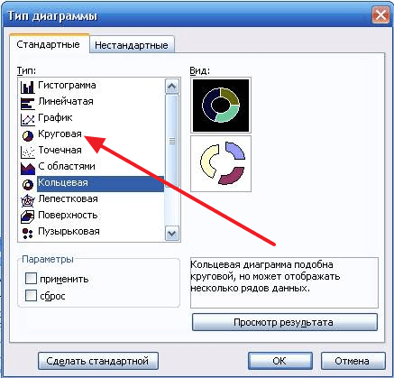
- In the drop-down list, you must select the desired type of pie chart.
That's it - the pie chart is ready.
To display the values on a pie chart, right-click anywhere on the pie itself and select “ Add data labels”
If you need to make a pie chart for another column, in our example it is revenue, then you also first need to select the columns that interest us. To do this, select these ranges by holding down the key ctrl on keyboard
If necessary, we also insert data signatures.

The human mind is designed in such a way that it is easier for it to perceive visual objects, otherwise they have to be represented. It is this fact that has led to the widespread use of diagrams. To create them, you do not need to install separate programs, just remember excel.
The process of creating a diagram
First of all, you will need to enter the initial data, most users try to create it on an empty sheet, which is a mistake. The table should consist of two columns, in the first it is necessary to place the names, and in the second the data.
Next, you need to select the table along with the names of the columns and columns, and then go to the "Insert" tab, selecting the "Charts" item there. Several options will be offered, 4 types are available in the “Pie” menu: the last two are used for complex data sets in which some indicators depend on others, for simple tables they use the first and second charts, they differ only in the presence of cuts. After clicking on the icon, a diagram will appear.
Change data and appearance
For a successful presentation of the material, it is not enough to know only how to build a pie chart inexcel, often it is necessary to edit it at your discretion. There is a special menu for this, which will become active after clicking on the diagram. There you can give it a different shape or save the current settings as a template if you need to create many similar ones.
Also, the color is configured here, for this you should select the desired style in the corresponding menu. To insert labels, you need to go to the “Layout” tab, the “Signatures” menu is located there, you need to select the “Data Labels” item, an additional window will appear.

To edit the inscriptions, you need to click on one of them and select the “Format of signatures” item. In a special window, you can customize their color, background, location, and content, for example, activate relative data instead of absolute data.

Of course, these are not all possible settings, but for most users they are enough to build a pie chartexcel.
If you need to visualize data that is difficult to understand, then a chart can help you with this. Using a chart, you can easily show relationships between different indicators, as well as identify patterns and sequences in your data.
You may think that you need to use difficult-to-learn programs to create a diagram, but this is not so. To do this, you will need a regular text editor Word. And in this article we will demonstrate it. Here you can learn about how to make a chart in Word 2003, 2007, 2010, 2013 and 2016.
How to make a chart in Word 2007, 2010, 2013 or 2016
If you are using Word 2007, 2010, 2013 or 2016, then in order to make a diagram you you need to go to the "Insert" tab and click on the "Chart" button there.
After that, the "Insert Chart" window will appear in front of you. In this window you need to select the appearance of the chart that you want to insert into your Word document and click on the "Ok" button. Let's take a pie chart as an example.

Once you choose a chart appearance, an example of what your chosen chart might look like will appear in your Word document. This will immediately open the Excel window. In Excel, you will see a small table with data that is used to build a chart in Word.

In order to modify the inserted diagram to suit your needs, you need to make changes to the table in Excel. To do this, simply enter your own column names and the necessary data. If you need to increase or decrease the number of rows in the table, then this can be done by changing the area highlighted in blue.

After all the necessary data is entered into the table, Excel can be closed. After closing the Excel program, you will receive the chart you need in Word.

If in the future it becomes necessary to change the data used to build the chart, then for this you need to select the diagram, go to the "Design" tab and click on the "Edit data" button.

Use the Design, Layout, and Format tabs to customize the appearance of the chart. Using the tools on these tabs, you can change chart color, labels, text wrapping, and more.
How to make a pie chart in Word 2003
If you are using the Word 2003 text editor, then in order to make a diagram you you need to open the "Insert" menu and select the item "Picture - Chart" there.

As a result, a chart and a table will appear in your Word document.

To make a pie chart right-click on the chart and select the "Chart Type" menu item.

After that, a window will appear in which you can select the appropriate type of chart. Among other things, here you can select a pie chart.
After saving the settings for the appearance of the chart, you can begin to change the data in the table. Double click the left mouse button on the diagram and a table will appear in front of you.

Using this table, you can change the data that is used to build the chart.
Standard Excel tools in pie charts allow you to use only one data set. This note will show you how to create a pie chart based on two sets of values.
As an example, I took the population of the Earth by continent in 1950 and 2000. (See the "Population" sheet of the Excel file; I removed Australia because its share is negligible, and the chart becomes hard to read :)). First, create a basic pie chart: select the range A1:C6, go to the menu Insert → Pie → Pie.
Rice. 1. Create a regular pie chart
Download note in format , examples in format
Right-click the chart and select Format Data Series from the shortcut menu. Select On Secondary Axis and then move the slider towards Separation, something like 70% (Figure 2). Sectors of one row will “disperse”.

Rice. 2. Minor Axis
Select individual sectors sequentially (double slow mouse click) and change their fill and location, connecting all sectors in the center (Fig. 3).

Rice. 3. Formatting points of a row (individual sectors)
Format all sectors so that the colors corresponding to the same continent in different rows are of the same gamut, but of different intensities. Complete the chart with data labels, a legend, and a title (Figure 4).

Rice. 4. Pie chart with two data sets
The diagram clearly shows, for example, that the share of Asia has increased from 55.8% to 60.9 over 50 years, while the share of Europe has decreased from 21.8% to 12.1% over the same time.
If you are not a fan of pie charts, you can use the donut chart, which works with several data sets in the Excel standard (Fig. 5); see also the "Die" sheet of the Excel file. Select the data area (in our example it is A1:C6) and go to the menu Insert - Charts - Other Charts - Donut:

Rice. 5. Create a donut chart
You just have to edit the diagram a little to make it more clear (Fig. 6)

Rice. 6. Donut chart
The idea was peeped in the book by D.Holey, R.Holey "Excel 2007. Tricks".
Good day!
Quite often, when working at a computer, you need to build some kind of graph or chart (for example, when preparing a presentation, report, abstract, etc.),
The process itself is not complicated, but often raises questions (moreover, even for those who have been sitting at a PC for more than a day). In the example below, I want to show how to build a variety of charts in the popular Excel program (version 2016). The choice fell on her, since she is on almost any home PC (after all, the Microsoft Office package is still considered basic for many).
A quick way to plot a graph
What's good about the new Excel is not only higher system requirements and a more modern design, but also simpler and faster charting capabilities.
I will show now how you can build a graph in Excel 2016 in just a couple of steps.
1) First, open a document in Excel, on the basis of which we are going to build a graph. Usually, it is a plate with several data. In my case - a table with a variety of Windows OS.
It is necessary to select the entire table (an example is shown in the screenshot below).

The bottom line is that Excel itself will analyze your table and offer the most optimal and visual options for its presentation. Those. you do not have to configure anything, customize, fill in data, etc. In general, I recommend to use.

3) In the form that appears, select the type of chart that you like. I chose the classic line chart (see example below).


Actually, on this diagram (graph) is ready! Now it can be inserted in the form of a picture (or diagram) into a presentation or report.
By the way, it would be nice to give a name to the diagram (but it's quite simple and easy, so I don't stop)...
To build a pie or scatter chart (which are very visual and loved by many users), you need a certain type of data.
The bottom line is that in order for the pie chart to clearly show the dependence, it is necessary to use only one line from the table, and not all. It is clearly shown what is at stake in the screenshot below.

Choosing a Chart Depending on the Data Type
So, we build a pie chart (screen below, see arrow numbers):
- first select our table;
- then go to the section "Insert" ;
- click on the icon ;
- select from the list "Pie Chart" , click OK.


Building a scatter or any other chart
In this case, all actions will be similar: also select the table, in the "Insert" section, select and click on "Recommended Charts", and then select "All Charts" (see arrow 4 on the screen below).
Actually, here you will see all the available charts: histogram, graph, pie, line, scatter, stock, surface, spade, tree, sun rays, box, etc. (see screenshot below). Moreover, by choosing one of the chart types, you can still choose its type, for example, choose the 3-D display option. In general, choose according to your requirements ...

Perhaps the only point: those charts that Excel did not recommend to you will not always accurately and clearly display the patterns in your table. Perhaps you should still stop at those that he recommends?
I have everything, good luck!


