For several years now, my Virtual School has been holding courses and trainings on working in Adobe Illustrator. Back in 2012, I recorded a short video course “Adobe Illustrator One-Two-Three”, which I still distribute for free to my subscribers.
Then, in 2014, together with my team, I launched an online training on creating vector illustrations for microstocks. The training turned out to be very popular and successful - we recruited groups of 50-70 people 4 times.
During the course, many of our students were able not only to create high-quality portfolios - they really began to make money on microstocks!
Several works of the participants of the training
To view the full image, click on its thumbnail


Alumni of our Adobe Illustrator training have often asked me if I plan to prepare a new training for advanced illustrators.
The question is quite natural, because in vector illustration, as in design, there is no limit to perfection!
Having learned how to draw simple icons, ornaments and textures, which are starting to be sold on microstocks, a person gets a taste. Drawing vector illustrations becomes not only a hobby for him, but also a constantly growing income. Of course, everyone wants to earn as much as possible, and for this you need to be competitive and constantly improve your skills.
It’s no secret that there is huge competition on microstocks. If you enter this market with a standard set of icons, abstract backgrounds and mockups, then it will be extremely difficult for you to stand out from the thousands of competitors with similar portfolios.
In order for your work to be noticed, they must be different, have their own "highlight".
There are 2 ways to do this:
Path one: to persistently look for new non-standard forms and visualization styles in order to stand out in the general mass of illustrators.
Path two: find a niche with relatively little competition and become one of the best in it.
You don't have to be a professor of sociology to figure out that the second option has a much better chance of succeeding.
But how to find such a niche? And how do you know that you can really succeed in it?
One day, in the process of searching for materials for lessons on working with a gradient mesh in Adobe Illustrator, I found illustrations on the Web Andrey Panchenko.
In addition to the "adult" theme in the author's portfolio, I saw a lot of funny "cartoon" characters - mostly illustrations of cute little animals with big eyes and shy smiles. The quality and attractiveness of these characters also did not raise doubts about the skill of the author.
I found Andrey's work on several stock sites and found
that they have a good rating - it is no coincidence that they are issued on the first page of Google when searching for children's cartoon characters.
I decided to write to Andrey and discuss possible cooperation. It turned out that the creation character illustrations- a fairly profitable stock niche, because, unlike others, there are not so many competitors in it yet.
Andrey sold his first illustration on microstocks 9 years ago, when he had only a few basic works in his portfolio. Moreover, the work is far from “killer”. Andrey himself today says that then he knew little. However, since then, his illustrations have been sold almost every day and bring the author a steady income, which is not affected by fluctuations in the exchange rate of the ruble against the dollar!
I also found out that Andrey himself had been thinking about teaching others for a long time, even recorded several videos for YouTube, but his hands didn’t get to something more ... In a word, he readily agreed to become one of the teachers of our Virtual School .
Meet:
Andrey Panchenko
illustrator,
microstocker.
“I have been illustrating for about 10 years. At first it was a hobby, but now it is my main professional activity.
Participated in many freelance projects, in particular, performed work for the Disney Channel. Worked with several large furniture firms, such as JSC "Vector" and "Leader", on the design of preschool products.
Currently I sell my illustrations on microstocks - I actively work with almost all major microstocks and draw illustrations to order.
Andrey's portfolio:
We decided to prepare a new training on the topic of creating character illustrations. Why on this topic?
Firstly, as I said, the niche of character illustrations is quite in demand with relatively little competition. By learning how to create such illustrations, a microstock illustrator or freelancer can significantly increase their regular income.
Secondly, drawing vector characters requires a high level of proficiency in Adobe Illustrator tools. Therefore, such a course will be especially useful to all those who want to properly "hone" their professional skills.
Well, and thirdly, I was extremely inspired by the workflow of creating illustrations performed by Andrey. His work is distinguished by high precision, confidence and rationality of all actions. It's simply mesmerizing to watch how funny mischievous characters appear on a blank slate before your eyes - a cat in boots, a tiger cub or a sheep.
I am sure that it will be extremely useful for novice illustrators to receive mastery lessons from Andrey.
The most interesting thing is that Andrei deliberately does not use a graphics tablet in his work - he draws all the illustrations with a regular mouse! Moreover, he does not have a tablet at all. Thus, he clearly debunks the myth that high-quality illustrations can only be created using a Wacom tablet.
Don't forget to turn on the sound on your computer
It took us more than six months to develop and create the course. As a result, Andrey recorded 30 detailed video tutorials, in which he showed in detail the process of creating a professional character vector illustration - from a pencil sketch to the final implementation in Adobe Illustrator.
The illustrations in the book are an important emotional factor influencing the reader of fiction, which has an aesthetic and semantic impact. Illustrations contribute to a better perception of texts of any level of complexity, helping to make a choice in favor of a particular publication!
In this article, we will introduce you to the main points of illustration and tell you how to do it. You just have to choose the appropriate way to design your book with illustrations.
The size, format, and arrangement of each illustration in a book has a purpose. You need to get familiar with how illustrations are usually posted and drawing techniques in order to communicate with illustrators in "the same language".
There are the following types of illustrations:
- Frontispiece. Such an illustration for a book is printed on a separate thick sheet of paper and glued to the left side of the first book block, the spread of the title page before the first page of the text material. As a rule, this sheet displays the main idea, the action of the story. In some cases, a portrait of the writer or the main character of the plot of the work is located here.
- Screensaver. It is used to decorate the beginning of a chapter or section, and reproduces the thematic transcript of the content of the entire rubric part of the publication, this is a kind of graphic introduction. The screensaver prepares the reader for the development of the plot, the emotional perception of the work. In addition to thematic pictures, an ornamental, symbolic, object-decorative thematic composition, called a ruler, is often used at the beginning of sections.
- Strip. A drawing that occupies the entire page of a book.
- Half-band. An image that is located anywhere on the page: top, bottom, right or left.
- On the turn. The image that occupies the spread of the publication.
- Defense. Thematic image framed by text.
- Drawings in the fields. Small images spread around the edge of the text strip.
- Background. Often used in color gift editions. The text is placed on top of the image.
- Ending or vignette. A drawing or graphic element is placed at the end of the text. It is performed in one plot-thematic performance with a screensaver.
The following are the main drawing techniques:
- pencil or charcoal;
- watercolor or oil;
- line drawing in the style of books from the glorious times of the USSR;
- computer graphics, including 3D;
- photo collage - an illustration made up of several photographs;
- photorealistic painting.
Get acquainted with the illustrations made in different techniques and choose the one that suits you best.
Coal  Watercolor
  Pencil
  Photorealistic painting
  line drawing
  photo collage
The attractiveness of the cover of the publication, the aesthetic and memorable appearance, thematically correctly selected illustrations are a guarantee of the future success of the book. And here it is important for the author to decide which method of illustration to choose.
Method 1: Order illustrations from an illustrator
Hiring a professional illustrator/graphic designer is one of the best ways to ensure your written work has high-quality images that match the presentation. All illustrations for the book are made in a single drawing technique, a single style is maintained, agreed with the author.
Involving an illustrator in the work is not the cheapest method, but the most advantageous in terms of quality and accurate transfer of the author's intent.
Method 2: Choose ready-made illustrations for an existing plot
This method is well suited for poems or stories, where all the illustrations are not connected by a common theme.
On the Internet you can find many ready-made images on the subject of the work. But you need to use them to design your book only with the permission of the artist or photographer, since in this case there is a copyright on the image. Failure to comply with this requirement can lead to unpredictable consequences: litigation, monetary fines.
Therefore, it is better to turn to the services of photobank sites, where all photographs, reproductions, drawings are provided for a small fee, and sometimes for free. A wide choice, high-quality execution of images allow you to design a literary work without violating other people's copyrights. Our publishing house uses the services of the www.lori.ru photo bank, where you can quickly find a suitable image by keywords.
Method 3: Find an artist among your relatives or friends
If you ask, you will be surprised how many people you know can draw. Let not very professional, but very nice and sincere. These people will welcome the opportunity to illustrate your book for free, for a small fee, or a favor in return. Let them draw on paper. And then the illustrations will be professionally scanned at the publishing house and inserted into the layout of the book.
Services of illustrators of TRIUMPH publishing house
Our specialists create illustrations in any technique. When ordering the publication of a work in our publishing house, the author gets the opportunity to work with the illustrator directly, which allows him not only to discuss the technique of performing work, the number of drawings, but also to agree on the cost. Payment is also made directly to the artist.
Igor Volkov
29.01.2018 12:00
visibility 2023
Figured out how and with what to illustrate the text
Illustrations help draw attention to the article and highlight important thoughts of the author. If you pay enough attention to the illustrations and choose them correctly, the quality of the text will become much higher.
In this guide, we'll cover:
What are illustrations, their functions and role in the text
Types of illustrations, where to find them and how to use them correctly
Principles of illustration: do's and don'ts
The instruction will be useful to everyone who works with texts - journalists, copywriters, editors.
Why illustrations are needed
An illustration is an information object that complements and reveals the thoughts of the text. In one of seminars Maxim Ilyakhov says they are not always represented by images. A little further we will analyze what other types of illustrations there are, in addition to pictures.
Illustrations perform four important functions.
Increase reader engagement. Illustrations make the text visually structured and easy to read. An article with pictures looks solid and attracts attention, while a bare sheet of text scares and alerts.
The blog.hubspot website has detailed statistics demonstrating the benefits of visual content. One metric reports that people are 328% more engaged with content with pictures than with the same text without pictures.
Compare for yourself:
328% this increases the reader's involvement in an article with pictures
For many texts, this is the main type of illustration. Whether we are writing about a product, talking about current events, or describing specific objects in the real world, photography is indispensable.Try not to use boring photos from the search results, they have already been taken millions of times. It is better to spend time and prepare the photographic material yourself. Well, or at least, look for a picture on the Internet more carefully. Photo stocks are not always bad, sometimes you can find a good illustration in them.
Photo from one of the free photo stocks. Could be a great illustration for an article about street art
Where to get. Ideal for photography. Illustrating an article with your own photos or requesting them from a client is much better than looking for suitable images on the Internet.
Free photo stocks. Sometimes you can find something decent.
INFOGRAPHICS
Infographic example: how much water is spent on the production of various products
In what cases to use. Infographics make complex information easier to understand and easier to remember. Use it if you need to explain difficult facts in the most accessible and simple way, to illustrate the principle of operation or the device of something.
In what cases to use. Ideal for data visualization if the text contains statistics, measurements and other numerical indicators. They clearly illustrate numerical information and show the relationship between quantities.
Where to get. The main tool for creating graphs and charts is Excel. You can also use other free services:
In what cases to use. Suitable when you need to show something in motion. Or more visually and with sound to present the product, show the process of work. In a word, videos, like photos, will fit almost any text.
Where to get. The best option is to record the video yourself or ask the client to do it. You can also look at video hosting sites. In addition to YouTube, check out the following resources:
Avoid overly glossy illustrations. In an article on how to write a blog for Habr, Sergey Abdulmanov says that people trust handicraft and realistic illustrations more:
“The best picture possible is how you and the installer kick the server box in a dim basement. Or like a rat stuck in a fan. Or shooting a specific chip (connector, cable or other part related to the post) with a caption what it is. In general, the picture should either be beautiful technically and visually, or be as eye-catching as possible. Because vyryglaznost shows that all this is real.
Don't overload
If illustrations are more important than text in the material, then a lot of pictures are justified. For example, in a recipe for cooking. When illustrations play a supporting role, it is better to keep a balance, otherwise the text will be uncomfortable to read.
Signs of a good illustration:
Truthfulness. The illustration must be lifelike. People instantly recognize a fake when they see smiling people in suits or pictures with a MacBook turned off. An English-language article on the contentmarketinginstitute.com blog talks about how photos of people from photo stocks instead of real employees undermine the credibility of the text and the company.
Concreteness. If the text talks about how to make a cherry pie, then the illustrations should show the process of making a cherry pie. Do not draw comics on abstract topics.
Clarity. The reader must clearly understand what the illustration tells him. It should be extremely accessible and understandable.
Briefly about the main
The four functions of illustration are to increase engagement in the text, reveal important thoughts, influence emotions, and communicate the topic and nature of the article.
The illustrations reveal and complement the thoughts of the author.
Illustrate only the most important.
Types of illustrations: photographs, drawings, text, diagrams and graphs, video, gif animation, diagrams, interactive.
Be careful with borrowing other people's illustrations - you can violate copyright.
Sign illustrations.
Avoid cheap and low-quality illustrations. Don't forget about layout.
The illustration must be specific, truthful and understandable. If the topic is abstract, use metaphors.
Where do you usually get illustrations for texts? What resources and services do you use? Write your thoughts, ask questions about illustration. We will definitely add the most interesting ideas to the article.
Tags: | |The post contains a selection of tutorials on creating vector graphics. In my opinion, most of the materials will seem interesting for beginners who are just beginning to comprehend vector art. But I think that specialists will also be able to find useful lessons for themselves.
Tutorials are free, but almost all are in English. For convenience, they are divided into three categories: getting started, creating faces, character design, landscape and environment, and special effects.
So let's go:
This tutorial explains how to create vector illustrations using Adobe Illustrator. An explanation of key parameters and tools is provided, supplemented by expert advice.

In this comprehensive tutorial, you'll learn the basic terms, workflows, and techniques to get you started with vector graphics.

The pen tool is one of the main tools in the program's arsenal, it is especially important for the initial mastery of vector graphics. This detailed guide aims to introduce you to the features and methods of working with an indispensable tool from Adobe. And also with the most rational ways to use it.

This video tutorial is a really valuable resource that explains how to create vector graphics in Illustrator and what role drawing plays in the process.

From using Bezier curve points to strokes, fills, and making vector graphics look more natural, these are just a few of the Illustrator tips in this tutorial that will greatly add to the beginner's arsenal.

Learn how to create simple organic shapes in Illustrator with this easy-to-follow tutorial from Veerle Pieters, graphic and web designer.
7. Adding Texture to Vector Illustrations
Adding texture is a great way to make your vector graphics more expressive and give them perspective. In this very accessible video, Illustrator expert Alexandra Cecilio demonstrates how to do just that.

This tutorial by Andrei Marius will help you create a vector line chart. Step by step, from a simple grid to guide lines, using only the Appearance panel (one of the most powerful tools in Adobe Illustrator), adding some simple text and fine shading.
Creation of faces
9. Create a vector eyeThis is a very useful video tutorial that shows the process of creating a vector eye as well as darkening the skin.

This is an in-depth video course that will help you master the art of creating vector portraits from photographs.

Another great tutorial on vector graphics. Ruslan Khasanov shows how to manipulate the work of vector lines and gradients to make the work more dynamic.

With the resurgence of the geometric trend, it's fair to say that WPAP can be represented in more different design aspects. This tutorial will show you how to create your own WPAP in Illustrator using the WPAP wizard.

Drawing hair in vector can be tricky. This tutorial shows step by step how to turn photo hair into vector hair.

In this tutorial, you will create an illustrated self-portrait in a geometric style. Your own photograph will be used as the basis for the illustration. She will help you sketch and then complete the rest of the work.

Illustrator and designer Yulia Sokolova shows you how to create a set of portraits that are perfect for social media or, for example, to represent different categories and professions on your website.

Jonathan Ball, Founder of Poked Studio, explains how Illustrator turns basic geometric shapes into unique, colorful characters.

In this tutorial, you will create a very simple stencil in an easy and fun way that can be used on a variety of surfaces (including t-shirts, walls, canvases). L. Carroll's fairy tale "Alice's Adventures in Wonderland" inspired the author to create a vector image and write a tutorial.

With this tutorial, Mary Winkler is going to show you how to draw a chibi character from scratch using the Shape Builder Tool (Shift-M), Pen Tool (P), transparent gradients, and many other Illustrator tools.

This guide walks you through the process of creating a simple anime character from start to finish.

Learn how to create cute bunnies in this vector graphics tutorial. The tutorial uses simple shapes and gradients that can easily be applied to illustrations of other characters.

This tutorial introduces so many basic shapes to achieve a really slick illustration style. And then "revives" the yeti with a palette of cold colors.

Here you can see how video game characters are created. You will have the opportunity to review the work from the first sketch to the very end.


If you are an avid football fan, then this tutorial will come in handy. In the tutorial, Sergey Kandakov creates a vibrant illustration with a retro effect.
Landscape and environment
25. Creating a vector infographic
This tutorial from vector artist Andrei Marius shows you how to create a simple card design in Illustrator.

This tutorial shows how to create a spectacular environment landscape in llustrator. Basic knowledge about the tools of the program will be enough to complete the task.

A very simple and consistent tutorial from Diana Toma that shows you how to draw beautiful flowers using gradient meshes.

In this step-by-step tutorial, you will learn how to create electric text in vector.

Tom Mac shows you how to create a drip-effect portrait in Illustrator using the Pen tool and some additional techniques.

In this tutorial, we will make a simple and beautiful oriental pattern in Adobe Illustrator, which will consist of various objects of Asian culture.

Over the years, vintage illustrations and retro styling have become popular again in design. In this tutorial, developer Ben Steers shares his techniques to help you convert vector art to retro style.

With Illustrator, you can create flawless vector graphics. But sometimes illustrations are required that resemble artistic sketches made in haste. The lesson shows how to draw a vector drawing in this style.

By following this tutorial you will be able to create a sparkle effect in Adobe Illustrator. The illustration is based on three effects: note paper, stained glass and torn edges. With the help of quick tracing, they turn into a shiny vector texture.

Halftone is a way to reproduce a monochrome image. It is based on the specifics of the perception of the picture by the human eye for which the image area filled with large dots is associated with darker tones. Conversely, an area filled with smaller dots is perceived as lighter. Artist Chris McVeigh shows you how to create a vector halftone.

In this tutorial, you will learn how to create a graphic Batman logo using simple shapes in Adobe Illustrator. Simple tools are used, like the Ellipse Tool (L) and the Shape Builder Tool (Shift + M).
36. Convert bitmap to vector
This Inkscape tutorial demonstrates how to convert a bitmap to a vector using the Trace Bitmap function.

Slider is a popular web design element. This tutorial shows how to create a slider in vector.

Ciara Phelan will show you how you can create an amazing collage by combining vector images and photos.

This tutorial from a design studio shows you how easy it is to draw and trace a photo. The example uses a simple gradient fill to create a realistic illustration.

This tutorial shows you how to create a cross stitch effect in Adobe Illustrator. For this, the Appearance panel and samples will be used.
You will see how I create a concept sketch, a background, and then gradually improve the image, drawing out the details. By the way, you can easily apply the techniques shown in this tutorial to your illustrations, logos, and other projects! Drawing lessons like this always seem to make the drawing process easier, but if you think you're not good enough at drawing, it's never a bad idea to just give it a try, as the goal of these lessons is to improve your skills anyway! I'm sure those of you who can't make scale drawings can start with quick sketches like this one.
I used the following tools:
- Photoshop CS3
- Wacom Graphire 3 USB Tablet (Blue)
Step 1 A: I started with a sketch. Then I painted the surface of the earth. Here, as you can see in the finished drawing, there is a lot of green grass and it reminds me of the old song: "Green Green Grass near the house." So try to imagine something like that. Perhaps here, not far from a small house, there is an old oak tree, in the shade of which you loved to play so much as a child. Once I decided on the scene, I began to think about the colors: the main and background shades. Here I tried to imagine a clear image. I started painting on a blank background, to which I added a few colors. I don't like to work with drawings, the background of which is simple and inexpressive. Adding different colors keeps the image interesting and also helps to set the right mood.
Step 2: I added details with a brush with a small diameter. For these illustrations, I only use the brushes that Photoshop already has by default. You can download other brushes if you like. Here are the brushes I used for this illustration. In my drawing, I will use only standard brushes. Before you start painting, you need to set up your brushes.

Step 3: Now you need to choose the main colors for your composition. And here are my colors for this illustration. As usual, I want to create a very bright drawing. For the background, I chose yellow and blue shades. All other colors are for the environment. Open another file and save your colors. And keep this new file always open while you draw.

Click on the image to view the image in full size and 100% quality.
Step 4: I decided to remove the old car that was at the house. She really doesn't fit in here. This car is not combined with the rest of the elements of the picture. So I had to erase the car and draw an old oak instead, you might want to draw some other tree. I made a rough sketch in color with a large diameter hard round brush, and then roughly painted the details with the same brush but with a smaller diameter. I also created a new layer for the grass and made a rough sketch.

Step 5: Then I started painting the green grass in more detail with a small hard round brush and smoothed out the image with a soft round brush...but later I can change this, for example, there may be reddish blue or yellow flowers. But for now, I think green grass is just the right thing.

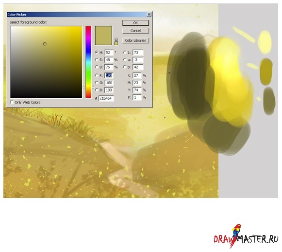
Step 6: When I look for a suitable color, I do this:
Step 7: Now pay attention to how I paint the wood. In this tutorial, I do not show many types of wood. Only two types are presented here: one for the door, and the second for the fence.

Step 8: And now let me resize the canvas. As you can see, if you want to get a drawing with a lot of detail, then you will have to work on a large canvas (about 2000 or 2600 pixels).

Step 9: Add details using a small brush. Here, pay attention to how I draw the details of the roof.

Click on the image to view the image in full size and 100% quality.
Step 10 A: In the next steps, I'm going to create a few more layers for the green grass. The reason for creating multiple layers is that you will need to adjust the drawing later. It is much easier to correct mistakes if the main elements of your drawing are separate objects. I rough-painted the drawing with a large hard round brush, and then added details with the same brush, but with a smaller diameter. I also created a new layer for the hair and made a rough sketch. Returning to the question of how to draw grass. Just click on the brush icon, choose a different color and paint as shown in my sketches. Then just repeat the same action.

Step 11: Now it's time to start detailing the clouds. When drawing the clouds, I shaped them with white on separate layers, and then changed the layer's blending mode to Overlay (Overlay) so that this effect was noticeable in the picture. And I only used two layers for the clouds. One color - as a base, and the other - to increase the brightness of the background. Try to find balance by combining different brush shapes and try painting clouds with different strokes. You also need to define lights and shadows. Photos of the real sky will help you in this matter. Just search Google for different cloud shapes.

Step 12 A: I also wanted to add some bright sunlight and other details like a flash of lightning. After several attempts, I settled on the option that is shown in my drawing. At this point, it looked pretty close, but I'll get to that later. I should also note that each element of the drawing ended up on a separate layer, which allowed me to quickly select the desired object and change colors with ease. Press Command + Click (on Mac) or Control + Click (on Windows) on the layer icon in the "Layers" palette in order to select opacity (opacity).

Step 13: Settings. It is very important. You can choose the right color and thereby change the whole atmosphere. Now I'm using Color Balance. After that I changed the brightness and contrast. You will notice how the light effect changes.

conclusions:
Now it's time to close Photoshop. I hope you liked it! As a finishing touch, I add a Smart Sharpen filter to the flat drawing in order to get crisper, sharper lines. This helps bring out fine details such as highlights. I hope you enjoyed reading this tutorial.

Click on the image to view the image in full size and 100% quality.


