For several years now, my Virtual School has been holding courses and trainings on working in Adobe Illustrator. Back in 2012, I recorded a short video course “Adobe Illustrator One-Two-Three”, which I still distribute for free to my subscribers.
Then, in 2014, together with my team, I launched an online training on creating vector illustrations for microstocks. The training turned out to be very popular and successful - we recruited groups of 50-70 people 4 times.
During the course, many of our students were able not only to create high-quality portfolios - they really began to make money on microstocks!
Several works of the participants of the training
To view the full image, click on its thumbnail


Alumni of our Adobe Illustrator training have often asked me if I plan to prepare a new training for advanced illustrators.
The question is quite natural, because in vector illustration, as in design, there is no limit to perfection!
Having learned how to draw simple icons, ornaments and textures, which are starting to be sold on microstocks, a person gets a taste. Drawing vector illustrations becomes not only a hobby for him, but also a constantly growing income. Of course, everyone wants to earn as much as possible, and for this you need to be competitive and constantly improve your skills.
It’s no secret that there is huge competition on microstocks. If you enter this market with a standard set of icons, abstract backgrounds and mockups, then it will be extremely difficult for you to stand out from the thousands of competitors with similar portfolios.
In order for your work to be noticed, they must be different, have their own "highlight".
There are 2 ways to do this:
Path one: to persistently look for new non-standard forms and visualization styles in order to stand out in the general mass of illustrators.
Path two: find a niche with relatively little competition and become one of the best in it.
You don't have to be a professor of sociology to figure out that the second option has a much better chance of succeeding.
But how to find such a niche? And how do you know that you can really succeed in it?
One day, in the process of searching for materials for lessons on working with a gradient mesh in Adobe Illustrator, I found illustrations on the Web Andrey Panchenko.
In addition to the "adult" theme in the author's portfolio, I saw a lot of funny "cartoon" characters - mostly illustrations of cute little animals with big eyes and shy smiles. The quality and attractiveness of these characters also did not raise doubts about the skill of the author.
I found Andrey's work on several stock sites and found
that they have a good rating - it is no coincidence that they are issued on the first page of Google when searching for children's cartoon characters.
I decided to write to Andrey and discuss possible cooperation. It turned out that the creation character illustrations- a fairly profitable stock niche, because, unlike others, there are not so many competitors in it yet.
Andrey sold his first illustration on microstocks 9 years ago, when he had only a few basic works in his portfolio. Moreover, the work is far from “killer”. Andrey himself today says that then he knew little. However, since then, his illustrations have been sold almost every day and bring the author a steady income, which is not affected by fluctuations in the exchange rate of the ruble against the dollar!
I also found out that Andrey himself had been thinking about teaching others for a long time, even recorded several videos for YouTube, but his hands didn’t get to something more ... In a word, he readily agreed to become one of the teachers of our Virtual School .
Meet:
Andrey Panchenko
illustrator,
microstocker.
“I have been illustrating for about 10 years. At first it was a hobby, but now it is my main professional activity.
Participated in many freelance projects, in particular, performed work for the Disney Channel. Worked with several large furniture firms, such as JSC "Vector" and "Leader", on the design of preschool products.
Currently I sell my illustrations on microstocks - I actively work with almost all major microstocks and draw illustrations to order.
Andrey's portfolio:
We decided to prepare a new training on the topic of creating character illustrations. Why on this topic?
Firstly, as I said, the niche of character illustrations is quite in demand with relatively little competition. By learning how to create such illustrations, a microstock illustrator or freelancer can significantly increase their regular income.
Secondly, drawing vector characters requires a high level of proficiency in Adobe Illustrator tools. Therefore, such a course will be especially useful to all those who want to properly "hone" their professional skills.
Well, and thirdly, I was extremely inspired by the workflow of creating illustrations performed by Andrey. His work is distinguished by high precision, confidence and rationality of all actions. It's simply mesmerizing to watch how funny mischievous characters appear on a blank slate before your eyes - a cat in boots, a tiger cub or a sheep.
I am sure that it will be extremely useful for novice illustrators to receive mastery lessons from Andrey.
The most interesting thing is that Andrei deliberately does not use a graphics tablet in his work - he draws all the illustrations with a regular mouse! Moreover, he does not have a tablet at all. Thus, he clearly debunks the myth that high-quality illustrations can only be created using a Wacom tablet.
Don't forget to turn on the sound on your computer
It took us more than six months to develop and create the course. As a result, Andrey recorded 30 detailed video tutorials, in which he showed in detail the process of creating a professional character vector illustration - from a pencil sketch to the final implementation in Adobe Illustrator.
In recent days, I have had some kind of unprecedented creative and working upsurge. Finally, I like my own work, made for both customers and stocks. Therefore, it is drawn and typeset easily, pleasantly, which pleases.
I want to slightly reveal the secret of the workflow. For a long time the idea has been lingering to record a video of how objects for stocks are drawn, but so far my hands have not reached something, so I will show it only in pictures and words.
Stage 1. Choose a topic
Where does work start? From the choice of topic. To be honest, I'm not particularly wise about trends, choosing niches (maybe that's why I have modest numbers in my wallet), I draw what I want. I chose a style for myself, calling it “multi-realism”, that is, realistic enough to convey volume, shadows, but at the same time leave cartoonish fury and gloss. Currently I'm working in the "objects" genre, but later I plan to include people and small plots here.
I never get the question “What to draw”, rather “What to draw first”. I am impressed by absolutely everything: food in cafes, shop windows, beautiful photographs of people, works of other authors. Fortunately, I do not have to sit at the monitor, drag different flowers back and forth in the hope that something worthy will come out. I completely abandoned the creation of backgrounds, textures, business cards and other things that are quite popular among other stockers. It just didn’t work, I didn’t enjoy the process when I made them, and accordingly they didn’t sell at all.
Sitting down at the computer, I always already have an idea of what I want to see as a result, but I'm getting ahead of myself a little.
So, the choice of topic. Always and everywhere I carry a diary with me, which, by the way, also not weakly sets in a creative way. And as soon as an idea comes to my mind, I add it to the Mind Map. I will not go into details of what it is, this information is easily googled, I will only clarify that the method is really cool. Allows you to structure ideas without squeezing them into frames, allowing the development of one thought indefinitely.
This is what my cards usually look like.
Ideas are written down in a cobweb, then they are thought over, analyzed. Something is postponed, and something gets life in the second stage.
Stage 2. Sketches
Everything here is extremely simple and clear, if I choose a topic, then I throw in exactly which objects can relate to it. And then I look for pictures of the necessary items and copy them into my moleskin. It is necessary to draw, stocks do not allow using other people's photos as direct references (redrawing other people's photos), but if you pick up several pictures, take something from one, something from the other, and eventually get your own drawing, then everything is fine, copyright right is not affected.
I draw, to be honest, so-so, the hand is not set to create straight lines, but this is not particularly necessary, for which I love the vector.
The sketches here have the role of approximate schematic sketches, from which I will take the general form. Later, Illustrator's tools will save you from crooked lines, allowing you to draw even circles and rectangles.


Stage 3. How do others do it?
For myself, I approved the basic principle of working with stocks: my pictures should be no worse in quality than those presented on the first pages among the popular ones. If the work falls short, I will procrastinate it until I am satisfied with the result. Naturally, here we are talking about works on the same topic and in the same technique as mine.
Yesterday I decided to draw on the theme of Fast Food. For this search query, I found cute sausages in dough, potatoes, cola. I chose what I would buy myself if I had such an order, and just what pleased the eye. I directly throw the found pictures on the sheet where I am going to work. I take nothing from them, neither color, nor form, nor style. I only need a general impression, everything else will come from my sketches and selected palettes.
Stage 4. Registration of the main forms.
Next comes the work on the computer. I have a graphics tablet, but I rarely use it, I like to boast that all my work was done with a mouse, which, by the way, is true. Main tool: pen. Those who understand the vector will understand what the point is. In short, the pen allows you to draw curved lines of any shape using points and vectors.
With a pen (for objects that require evenness: mugs, plates, boxes - ellipses, rectangles), I trace the main details, paint them in chaotic colors, just to determine the shape.
As a result, such unattractive illustrations are obtained, but the general idea is already clear, further only complication. 
This 5. Color matching.
Color selection is one of the most important moments that I categorically do not trust myself and do not select colors myself. There are many services that allow you to collect beautiful palettes, but this is not quite the same. The main assistant in the selection of colors was the service: shutterstock.labs. An interesting thing, I recommend digging, even just for the sake of general development. The site allows you to select photos on topics of interest, taking into account the preferred palette. For example, I know that for drawing Fast Food I will most likely need yellow, red, orange, brown and their shades. I form the corresponding search query and the program gives me ready-made photos with the same hot dogs, potatoes and other things, and even in bright, beautiful colors, which I will later use in my work thanks to the eyedropper tool.
Stage 6. Development of the subject.
The draft part of the process is over, let's start creating. For the rendered details, I select colors from the found photos, after which I add new details: shadows, highlights, light, texture. As a result, I get a set of individual items that can now be combined. 
Stage 7. Compilation of compositions.
The objects are drawn, it's time to think about how to present them. Even during my short work as a stoker, I managed to figure out that compositions are sold better than just objects on a white background (although I also upload it in this form, sometimes they buy it). Therefore, now I simply combine our entire collection into different pictures, with backgrounds, without backgrounds, with inscriptions, without them. The more you can make from one collection of pictures, the better. I especially like it when some items can be taken from past works. For example, I added ice cream from the Summer collection to the Fast Food set. Therefore, I try to draw in the same style so that everything can be combined. 
This is what my work on pictures looks like. I found that such stages left their mark on my design activity, I began to make products of a different style and much better quality, which also pleases.
The same word “illustration” refers to images that are different in content and form, in meaning for the work and the reader, in the connection between the drawing and the text, in the technique of execution. “According to the goals pursued by the image, illustrations can be divided into scientific and educational(maps, plans, schemes, drawings, etc.) and artistic and figurative(interpretation of a literary work by means of book graphics). Illustrations may be an explanatory image to the text, complementing the text, and an image almost completely independent, sometimes even subordinating the text".
“Depending on the size and location in the book, there are the following types of illustrations:
- Frontispiece. An element of artistic design of the publication, which is an illustration placed on the left page in a spread with the title page.
- Screensaver. Screensaver illustrations are placed at the beginning of a part or chapter of a book on the slippage along with the text, signify the beginning of one of the parts of the story, are usually located at the top of the page and are separated from the text by a white margin. They help the reader to focus on new material, emotionally tune in to it. Screensavers may depict the scene described at the beginning of the chapter; talk about the main theme of a part or chapter; show a scene or landscape that should evoke the appropriate mood in the reader. Screensavers can also be subject-decorative or symbolic.
- Strip illustration (full page), half-page illustration (on half a page), double-page illustration (on two pages). The choice of illustration format is determined depending on the importance of the illustrated event, image, etc. The content of such illustrations usually has a direct bearing on the text that precedes or follows them. For large centerfold or strip illustrations, important events of the work are chosen. Illustrations largely determine the architectonics of the book, so it is necessary to pay attention to their rhythmic alternation and uniform saturation of the entire text with them.
- Defense(small figure surrounded by text), marginal drawings - less significant events.
- Ending illustrations placed at the end of parts, chapters or the whole book. They, like screensavers, can be subject-thematic, ornamental-decorative or symbolic.
Intros and endings should be done in the same style, as they are interconnected and are often side by side on a book spread.
Technician there are a lot of illustrations. They can be used alone or combined with each other. Let's consider some of them.
- Painting materials(watercolor, gouache, acrylic);
- Graphic materials(charcoal, sanguine, sauce, retouching, Italian pencil);
- Collage(French collage - sticking, sticker) - a technique for creating a work of art, when various materials (fragments of newspapers, wallpaper, colored paper, finishing materials, fabrics, wire, wood, ropes, metal) are attached to the base and perceived as a fragment of reality. Collage was introduced by P. Picasso and J. Bracom in 1912. K. Carra, J. Severini, H. Arp, A. V. Lentulov worked in this technique.
- Application - lat. applicatio - application). Pieces of any material (fabric, paper, fur, straw, etc.) are sewn on, glued onto fabric, paper, cardboard. Images or ornaments created in this way give the work a special relief and expressiveness. .
- Photomontage- a composition made up of photographs and their fragments, sometimes supplemented with graphic elements. Used in the 20th century. in printed graphics, poster. The name was coined by Berlin Dadaists to refer to works assembled from photographs. Photomontage was used by J. Heartfield (1891–1968), A.M. Rodchenko, L.M. Lissitzky.
- computer graphics:
"Bitmap is a data file or structure that is a grid of pixels or dots of colors (usually rectangular) on a computer monitor, paper, and other display devices and materials.
Vector graphics is the use of geometric primitives such as points, lines, splines, and polygons to represent images in computer graphics. The term is used in contrast to raster graphics, which represent images as a matrix of pixels (dots)."
3D graphics (3D, 3 Dimensions, Russian 3 measurements) - a section of computer graphics, a set of techniques and tools (both software and hardware) designed to depict three-dimensional objects. It is most commonly used to create images on a screen plane or a sheet of printed matter in architectural visualization, cinematography, television, computer games, printed matter, as well as in science and industry.
The oldest way of illustrating is to use printed graphics. Linocut,woodcut,zincography, lithography, engraving on cardboard, engraving with a chisel on copper, etching, mezzotint, aquatint, drypoint.
Each instrument has its own sound and its own feel in the fingers. From the choice of tools largely affects the nature of the image. Often the theme of the illustration itself determines the technique and style of the image. “Style is pretty much the choice of instrument. In good typography, the trace of the calligraphic tool is always visible. It's not a problem if you're illustrating on paper, but in digital art, you have to make some effort to keep the genetic imprint of living drawing." For example, Jonathan Edwards - uses a vector, but his illustration lives on (Figure 25. Appendix 1). Drawing even with the use of raster, vector or three-dimensional graphics is necessary to "keep the life" of the image.
Absolutely all fine art techniques are available for illustration, according to tradition, graphic materials are used in illustration, but this is far from being the case.
In modern illustration, certain innovations and trends are constantly being formed, it can be black and white linart (the use of one black line when depicting, without shading, spots and fills), the inclusion of a bit of such strange neo-Gothic in the drawing, there may be small op-art effects, vigorous color expressism, street art.
But the question is, what trend should a modern illustrator support - one that is abundant in various publications or one that one likes?
And yet there are signs that vector, and in general digital graphics, is beginning to annoy the public as well.
There is a trend recently discovered Sergei Pervushin(Fig. 26. Appendix 1), a famous illustrator: a photo with drawn elements, a way to tell about the presence of the unknown. “The presence of photographic elements in the illustration (it seems to be rather the opposite, here photography occupies most of the area - but the drawn elements confidently scoop it up under themselves and turn it into an illustration) gives it so many graphic delights, so much reliability that, in general, it is strange that this the story has not yet merged into a normal illustration, but remains some kind of self-sufficient game. It is worth a little to go beyond the plane of the sheet, as much more interesting things begin. Illustrators work with collage, using traditional materials (paper, fabric, photographs), or such medium as
- plasticine(Fig. 27, Annex 1);
- papier mache;(French papier-mâché “chewed paper”) - an easily moldable mass obtained from a mixture of fibrous materials (paper, cardboard) with adhesives, starch, gypsum, etc. Papier-mâché is used to make dummies, masks, teaching aids, toys, theatrical props , jewelry boxes, etc. In some cases, even illustrations;
- book sculptures(Fig. 28. Appendix 1) - Books can not only be read, but, it turns out, you can create from them. Like Nicholas Jones.
- paper plastic(Fig. 29. Appendix 1) - in terms of creativity, it is very similar to sculpture. But, in paper plastic, all products are empty inside, all products are shells of the depicted object.
As a result of folding a sheet of paper, a system of stiffeners is created for any design. For more complex products, in addition to straight lines, curvilinear ones are used. Objects for the image in this technique can be illustrations.
Yes, anything, the main thing is that the material corresponds to the theme of the work. "Needlework- a great way to compensate for the lack of pure drawing skills - a way that is more effective and, most importantly, trendy than the imposed trends associated with the pure use of graphic editor technologies.
The type and technique of illustration should be a function of the creative task. The choice of technique, as a bunch of proven moves, allows the artist to be confident in the quality of the illustration.
Conclusions on the second chapter
In the history of illustration, we are talking about its constant change, in accordance with the development of culture and art in general. About its synthesis with fine art, design and book graphics. The tendencies of illustration of the 20th century are also considered. influenced by the styles of the Modern era. And the main trends 21st century, refer more to the side of the illustration technique. The concept of illustration is revealed according to three signs, according to one sign it can be attributed to high art. What distinguishes it as a special genre of fine art. These are drawings, works of painting and sculpture, which were performed on literary themes, but at the same time had an independent artistic value. According to others, an illustration is a type of book graphics, which is a work intended for perception in a certain unity with the text, that is, located in a book and participating in its perception in the process of reading. According to the third, an illustration is an explanation of the text by demonstrating a visual image, an active interpretation of the text. These are scientific and educational illustrations (maps, plans, diagrams, drawings, etc.), as well as illustrations that design utilitarian products (images on money, stamps, information materials, envelopes, packaging). Such an illustration can be attributed to applied graphics.………………………… The right choice of technique and type of illustration allows the artist to be confident in the quality and relevance of the illustration.
Surely, many artists have repeatedly wondered how to create digital illustrations, and not just of a satisfactory level, but of high-quality work that will take the breath away from any sophisticated viewer. This, like any craft, requires constant attention and time.
To begin with, it is necessary to understand the very process of creating digital painting, which can develop in several directions. The article will tell you about these options, among which you can choose the one that suits you.
Creating an illustration from a photo
The main advantage of this method is that it will suit everyone without exception, giving an opportunity to those who cannot boast of the ability to draw well. The principle of such an outline is as follows: the original photograph serves as the basis for the drawing until the artist feels comfortable continuing to work without it.
If, for example, you work in Adobe Photoshop, then by reducing the transparency of the photo and creating a new layer, you can safely create an illustration stroke by stroke, repeating all the lines and folds of objects. This can be done both with a mouse and with a special tablet with a stylus - an accessory in the form of a small thin pen for controlling a device with a touch interface.


Below is a video showing this method of creating such illustrations:
Creating an illustration from a scanned drawing
This method is already for people who actively practice creating high-quality illustrations, that is, who can draw.
So, the finished (or partially finished) work is scanned and opened in the appropriate program on the computer for further imposition of strokes on top of the drawing.
The following videos will demonstrate this method in practice:
https://youtu.be/UVGxAJL7dSQ
Create an illustration directly on the computer
As the name suggests, this is the most difficult level, which is actively used by professionals in this field.
Relevant videos attached:
You will see how I create a concept sketch, a background, and then gradually improve the image, drawing out the details. By the way, you can easily apply the techniques shown in this tutorial to your illustrations, logos, and other projects! Drawing lessons like this always seem to make the drawing process easier, but if you think you're not good enough at drawing, it's never a bad idea to just give it a try, as the goal of these lessons is to improve your skills anyway! I'm sure those of you who can't make scale drawings can start with quick sketches like this one.
I used the following tools:
- Photoshop CS3
- Wacom Graphire 3 USB Tablet (Blue)
Step 1 A: I started with a sketch. Then I painted the surface of the earth. Here, as you can see in the finished drawing, there is a lot of green grass and it reminds me of the old song: "Green Green Grass near the house." So try to imagine something like that. Perhaps here, not far from a small house, there is an old oak tree, in the shade of which you loved to play so much as a child. Once I decided on the scene, I began to think about the colors: the main and background shades. Here I tried to imagine a clear image. I started painting on a blank background, to which I added a few colors. I don't like to work with drawings, the background of which is simple and inexpressive. Adding different colors keeps the image interesting and also helps to set the right mood.
Step 2: I added details with a brush with a small diameter. For these illustrations, I only use the brushes that Photoshop already has by default. You can download other brushes if you like. Here are the brushes I used for this illustration. In my drawing, I will use only standard brushes. Before you start painting, you need to set up your brushes.

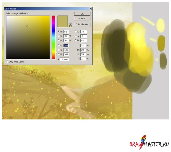
Step 3: Now you need to choose the main colors for your composition. And here are my colors for this illustration. As usual, I want to create a very bright drawing. For the background, I chose yellow and blue shades. All other colors are for the environment. Open another file and save your colors. And keep this new file always open while you draw.

Click on the image to view the image in full size and 100% quality.
Step 4: I decided to remove the old car that was at the house. She really doesn't fit in here. This car is not combined with the rest of the elements of the picture. So I had to erase the car and draw an old oak instead, you might want to draw some other tree. I made a rough sketch in color with a large diameter hard round brush, and then roughly painted the details with the same brush but with a smaller diameter. I also created a new layer for the grass and made a rough sketch.

Step 5: Then I started painting the green grass in more detail with a small hard round brush and smoothed out the image with a soft round brush...but later I can change this, for example, there may be reddish blue or yellow flowers. But for now, I think green grass is just the right thing.

Step 6: When I look for a suitable color, I do this:
Step 7: Now pay attention to how I paint the wood. In this tutorial, I do not show many types of wood. Only two types are presented here: one for the door, and the second for the fence.

Step 8: And now let me resize the canvas. As you can see, if you want to get a drawing with a lot of detail, then you will have to work on a large canvas (about 2000 or 2600 pixels).

Step 9: Add details using a small brush. Here, pay attention to how I draw the details of the roof.

Click on the image to view the image in full size and 100% quality.
Step 10 A: In the next steps, I'm going to create a few more layers for the green grass. The reason for creating multiple layers is that you will need to adjust the drawing later. It is much easier to correct mistakes if the main elements of your drawing are separate objects. I rough-painted the drawing with a large hard round brush, and then added details with the same brush, but with a smaller diameter. I also created a new layer for the hair and made a rough sketch. Returning to the question of how to draw grass. Just click on the brush icon, choose a different color and paint as shown in my sketches. Then just repeat the same action.

Step 11: Now it's time to start detailing the clouds. When drawing the clouds, I shaped them with white on separate layers, and then changed the layer's blending mode to Overlay (Overlay) so that this effect was noticeable in the picture. And I only used two layers for the clouds. One color - as a base, and the other - to increase the brightness of the background. Try to find balance by combining different brush shapes and try painting clouds with different strokes. You also need to define lights and shadows. Photos of the real sky will help you in this matter. Just search Google for different cloud shapes.

Step 12 A: I also wanted to add some bright sunlight and other details like a flash of lightning. After several attempts, I settled on the option that is shown in my drawing. At this point, it looked pretty close, but I'll get to that later. I should also note that each element of the drawing ended up on a separate layer, which allowed me to quickly select the desired object and change colors with ease. Press Command + Click (on Mac) or Control + Click (on Windows) on the layer icon in the "Layers" palette in order to select opacity (opacity).

Step 13: Settings. It is very important. You can choose the right color and thereby change the whole atmosphere. Now I'm using Color Balance. After that I changed the brightness and contrast. You will notice how the light effect changes.

conclusions:
Now it's time to close Photoshop. I hope you liked it! As a finishing touch, I add a Smart Sharpen filter to the flat drawing in order to get crisper, sharper lines. This helps bring out fine details such as highlights. I hope you enjoyed reading this tutorial.

Click on the image to view the image in full size and 100% quality.


