As promised, I'm posting it here...
It is believed that there are three primary colors, and all other colors can be obtained by mixing the primary colors at different proportional ratios...
All spectral colors are called chromatic
All rest Colors are made by mixing primary colors.
gray white and black called achromatic
Complementary flowers are oppositely located colors in the spectrum.
When they are located next to each other, they strengthen, ignite.
main color characteristics:
1. Hue (hue in relation to the main color of the spectrum)
2. Lightness (greater or lesser proximity of color to white)
3. Saturation (the degree of brightness of a color, varies depending on the presence of gray in it)
4. Heat-coldness (All chromatic colors and their shades are divided into warm and cold.
Warm colors include the colors of fire and the sun - yellow, orange.
Cold colors include the colors of water, ice - blue, blue.)
*
Within each color there can be warmer and colder shades. For example, a red color can be cold if it has a bluish tint, and warm if it has a yellow tint. Green color with a yellowish tint - warm, and with blue - cold.
...Warm and rich
e
(bright) colors attract more attention and give the impression of being close to the subject. They are also called approaching], speakers.
... Cool colors and desaturated
give the impression of distance. Therefore, they are called removing, retreating.
Yellow color has the greatest approximating effect, blue has the most receding effect. Colors depicted on the same plane may appear closer or more distant from the viewer. Using this property of colors, you can convey volume and relief, zoom in and highlight some parts of the photo and push others into the background.
The property of approaching and removing colors depends on the background on which they are located. On a light background, they stand out better, dark tones come out, light ones are lost, and on a dark background, light and bright tones stand out more, and dark ones disappear.
All chromatic colors stand out better against a gray background.
Colors tend to change depending on the light source. In daylight, all colors look cleaner, more transparent. Under artificial lighting, the color may change. For example, white and gray colors turn yellow, blue - darkens and appears black, purple may turn red or blue.
Depending on how the object is located to the light source, there are
sixtransitional degrees
chiaroscuro:
glare - a particularly highlighted part of the subject.
light part - part of the object facing the light source;
semitone - part an object located at any angle to the light;
shadow part - part of an object located on the opposite side of the light source;
reflex - light reflected from any surrounding objects.
shadow, falling from an object to another illuminated part;
The harmony of colors obeys certain laws, and in order to better understand them, it is necessary to study the formation of colors. To do this, use the color wheel, which is a closed band of the spectrum.
At the ends of the diameters dividing the circle into 4 equal parts, there are 4 main pure colors - red, yellow, green, blue
By mixing each color separately with white and black paint, light and dark tones of the same color are obtained.
Bright hues located on the inside of the color wheel, and dark - on the outside.
Monochrome - colors that have the same name, but different lightness, that is, transitional tones of the same color from dark to light (obtained by adding black or white paint to one color in different quantities). These colors are the most harmoniously combined with each other and are easy to select.
Related - colors are located in one quarter of the color wheel and have one common main color(e.g. yellow, yellow-red, yellowish-red). There are 4 groups of related colors: yellow-red, red-blue, blue-green and green-yellow.
Related-contrasting colors are located in two adjacent quarters of the color wheel at the ends of the chords (that is, lines parallel to the diameters) and have one common color and two other color components, for example, yellow with a red tint (yolk) and blue with a red tint (violet) . These colors are coordinated (combined) with each other by a common (red) tint and are harmoniously combined. There are 4 groups of related-contrasting colors: yellow-red and yellow-green; blue-red and blue-green; red-yellow and red-blue; green-yellow and green-blue.
Related-contrasting colors are harmoniously combined if they are balanced by an equal amount of the common color present in them (that is, reds and greens are equally yellowish or bluish). These color combinations look more dramatic than related ones.
Contrasting colors. Diametrically opposite colors and shades on the color wheel are the most contrasting and inconsistent with each other.
The more colors differ from each other in hue, lightness and saturation, the less they harmonize with each other.
coloring- a certain relationship of all colors and tones of the work, subordinate to the general tone. Coloring, depending on the predominance of certain tones, can be light or dark, bright or gloomy, cold or warm. AT artistic photography it is necessary that each color taken in combination with other colors should not stick out or disappear, but would create general impression main, main tone. The richness of color is not in variegation, but in a variety of shades and color transitions.
There are several rules that will help you when choosing a harmonious combination of colors.
Color ------------------> Harmonizing colors
Color - Red
Harmonizing colors-Green, gray
Color - Raspberry
Harmonizing colors-Pearl gray, mauve
Color-Dark red (bardo)
Harmonizing colors-Black, blue, beige
Color-Scarlet
Harmonizing colors-Light blue, green
Color-Dense pink
Harmonizing colors - Various shades of blue
Color-brown-pink
Harmonizing colors - Blue, cream
Color-Pale pink
Harmonizing colors - light green, pale lilac, blue
Orange color
Harmonizing colors - Violet, pale blue, bright blue
Color-Straw yellow
Harmonizing colors - Pale pink, grayish blue, green
Yellow color
Harmonizing colors - Violet, blue, green
Color - [Pale yellow
Harmonizing colors - Light lilac, grayish pink, pale green
Color-Golden
Harmonizing colors-Light gray, green, dark red
Color-Dark green
Harmonizing colors-Brown, beige
Color-Grey-green (color sea wave)
Harmonizing colors - Cornflower blue, orange
Color-Blue
Harmonizing colors - yellow, sand, orange, pink
Color-Pale green
Harmonizing colors-Dark green, lilac pink
Color-Grey-blue
Harmonizing colors - Bordeaux, gray
Color-Purple
Harmonizing colors - Light and dark shades of green
Color-Pale lilac
Harmonizing colors-Green, gray, mauve
Color-Mauve
Harmonizing colors - Emerald green, dark red, brown
Brown colour
Harmonizing colors - Orange, red, beige
Color-Gray
Harmonizing colors - Violet, raspberry, pale lilac
Primary colors of the rainbow, arranged according to their position in the spectrum (1)
and in descending order of lightness (2).
3 - monochrome variant of color range 2
Contrast of light and dark tones:
Our vision is most sensitive to changes in brightness - we perceive not only strong differences in light and dark, but also the subtlest nuances of changes in the lightness of tones.
Between complementary colors, the color contrast of which is considered very strong, there is a different brightness contrast - between red and green it is the smallest, and between yellow and purple it is maximum.
A harmonious photo often contains more or less a set of midtones of varying brightness from very light to very dark. Changing the distribution of midtones in an image can often fix a dull image.
color contrast:
It is believed that the simultaneous contrast of the three main colors is the strongest.
A color image based on color contrast may lose its information content when converted to monochrome.
Color contrast enhances the feeling of cheerfulness, purity, determination, energy. It is used to convey strong emotions.
Photo byAndrey Turtsevich
Contrast of warm and cold:
Surprisingly, warm and cold colors, which are so naturally associated with temperature, can also convey a sense of the depth of space. The reason for this is the properties of the earth's atmosphere to color distant objects in bluish tones. The farther an object is from us, the colder it seems. Artists use this to enhance the sense of closeness of objects by deliberately coloring them in warmer tones.
By contrasting warm and cold, you can enhance the sense of depth in landscape photography,
the contrast of warm and cold can be used to convey dynamics.
The situation when distant objects are shown in the frame in warmer colors can lead to dissonance.
Contrast in area of color spots:
The principle of using color contrast by area is that in order to enhance the sound of any color shade, it is used in a smaller amount. By changing the proportions of the colors in the frame, you can create a new color effect. In order to correctly determine the proportion, it must be taken into account that the effect of color is determined not only by the occupied area, but also by other types of color contrast.
The lighter the color, the smaller its proportion must be to achieve the effect of contrast in area.
Here are the approximate values of the degree of lightness of the main unbleached colors of the rainbow according to ten-point scale: red - 6, orange - 8, yellow - 9, green - 6, blue - 7, blue - 4, purple - 3.
A harmonious combination is provided by shades whose overall perception corresponds to monochrome gray, however, in order to create a harmonious work, it is necessary to take into account both the color shade itself and the area it occupies.
For example, red and green - additional colors. This means that their combination will be perceived as a harmonious neutral gamma, if each color in the photo takes equal area, for the reason that the degree of lightness of both colors is approximately the same.
The situation is different when using another combination additional colors- purple and orange. Since yellow is three times lighter than violet, in order to achieve a harmonious monochromatic effect, it must be taken in three times less quantity.
If we correlate red and green colors in a ratio of 1:3, we will get a completely different perception of the gamut of red and green, where the effect on the area of color spots will create a new effect.
Complementary color contrast:
Unlike other types of contrast, this one appears between specific pairs of shades - for each color there is a single color that is complementary to it. Complementary colors are two colors that, when mixed, give a neutral tone. The theory of color harmony is based on the action of additional shades - such a combination of several shades is considered to be the most harmonious, the general perception of which would correspond to a neutral tone.
The contrast of complementary colors is one of the strongest; when using it, it is necessary to take into account not only the psychology, but also the physiology of human color perception. For example, looking at a single-color object will result in the appearance of an additional color in the field of view. This effect must be taken into account when composing color photographs.
thank you very much Andrey Turtsevich for such an intelligible disclosure of the topic!
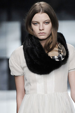
July 30, 2014Many fashionistas are afraid to choose an image that combines more than three colors, the rest are at risk, often making annoying mistakes.
In fact, correctly combining the colors of clothes and accessories is much easier than it seems at first glance. Fortunately, color harmony obeys the laws, which it is advisable to familiarize yourself with for everyone who has difficulty choosing colored clothes.
The foundations of color science are based on the theory of the "color wheel", in which all visible to the eye colors.
Color matching by contrast is one of the winning options. Considering that this is a circle, draw a line-radius through the center of the circle, for example, from green - and it will lead you just in time for the color of fuchsia. This will be the optimal contrast combination.
If you are afraid of the brightness of the contrast, choose deaf or pale shades. When choosing contrasting colors, it is advised to take them not in equal proportions. For example, a suit dark shades, and red - only a scarf, collar or handbag.
One of the most complex combinations - achromatic palette colors, when an image is built around black, white or gray, without using other colors.
A more reliable combination in a combination of colors of clothes is a harmonious combination. This combination is the most pleasing to the eye, these are the colors, as it were, passing into each other, devoid of contrast and challenge.
How to match colors in clothes
There are six basic color combinations. Each of them can give an infinite number of different color palettes.
Take the following combination options for the base: monochrome, complementary and triadic.
- With monochrome, consisting of colors of one sector of the circle, combine several shades of the same color.
A monochrome combination can be diluted with a neutral color. Nearby colors on the wheel blend beautifully and produce a harmonious and pleasant impression. - With complimentary, where two opposite colors are used in the circle, choose tones that beautifully set off each other and give the color a "play".
A split complementary scheme is a scheme in which one of the opposite colors is replaced by two adjacent colors on a circle. - With triadic A combination of three equally spaced colors on the color wheel is chosen.
Primary scheme It is a combination of the three primary colors (red, blue and yellow).
secondary scheme is a combination of three secondary colors (orange, green and purple). They are obtained by mixing primary colors (red and yellow make orange, yellow and blue make green, and blue and red make purple).
Tertiary scheme is a combination of three equidistant tertiary colors (red-orange, orange-yellow, yellow-green, green-blue and blue-violet). They are formed by mixing primary colors with secondary ones.
By simplifying it to 12-16 shades, you can more accurately determine the options for approximate combinations. Such a color wheel is convenient for selecting harmonious color combinations from 2, 3 or 4 colors. In each example, the lines connecting different colors can be mentally rotated in a circle, getting new combinations.
| 2 opposite colors: combination with high contrast. | 3 colors: classical triad, colors arranged in a triangle. | 3 contrasting colors: two colors are almost related, one is contrasting. |
| Red+Green | emerald green+yellow-orange+purple cobalt blue + light green + orange azure blue+lemon+red blue+yellow+pink | Example: green + yellow + pink. |
| Very close variant: 4 colors: 3 related and 1 contrast. | 3 related colors: weak combination. | 4 colors: two mutually reinforcing. |
| Example: yellow + blue + purple + pink. | Example: lilac + shades of pink. | Example: blue + salad green + pink + warm beige instead of orange. |
Examples of color combinations in clothes
Consider the color wheel, color combination schemes and simple examples.
Combination of analog colors - soft, calm combination of three neighboring flowers spectrum. Choose the main, complementary and accent tone, be sure to use shades of color that are different in brightness.
A combination of opposites(complimentary) colors. According to color theory, each warm color is harmoniously combined with the cold opposite to it. These pairs are easy to identify using the spectral circle (color wheel).
The combination of combined complementary colors - a less contrasting variant of the combination of opposites. Such a scheme, when one color is combined with two opposite, close to each other, is perceived by the eye more harmoniously.
Classic triad - a combination of a combination of 3 colors that are located at the same distance from one another (at the vertices equilateral triangle). It is also worth choosing one dominant color, and the other two - shading and complementing the main one.
Rectangular pattern combination consists of two pairs, each of which contains the opposite color and its corresponding analog. This option is more diverse, but requires precise balance between the primary and secondary colors.
Color harmony is not limited to 4 color combinations. A hexagon can also be inscribed in the color wheel, the vertices of which will indicate extended color harmonies. Bright, juicy color combinations can be diluted with universal ones - black, white, gray and beige. it good way expand the color range without the risk of overdoing it and becoming like a rainbow.
Color saturation
The color may be lighter or darker. In other words, the color has saturation. To show saturation, the color wheel has several rings; two large rings for dark shades and two small ones for light ones.
Each color can be used in varying degrees of intensity. In the color wheel below, each color is divided into 6 rows - from light pastels to muted, in the middle - bright and pure colors.
The most contrasting combinations will be:
1. bright colors.
2. Pastel and muted colors.
3. Pastel and muted shades of the same color.
Combinations with weak contrast.
1. Between pastel colors.
2. Between muted colors.
3. Between shades of the same color, close to each other in saturation.
It must also be remembered that great importance for visual perception has color induction, i.e. change in the characteristics of one color under the influence of another. If you place a dark and light colors, then the dark will appear darker, and the light - lighter.
According to www.myshulka.ru, maxlozovski.com, dresshelp.ru
By the way, you can print (or draw: o) a color wheel, throw it in your purse and go shopping!
In moments of uncertainty, remember the color wheel and the basic laws of color harmony, the rest of the time - trust your intuition and inspiration!
Good luck to you!
6 rules of color combinations in clothes that should not be violated
 A stylish image is 99% made up of the right combination of colors in clothes, makeup, and accessories. If the colors are combined incorrectly, there is a feeling that something is “wrong” in the look.
 This is connected not so much with a conscious understanding of the fashion and style of things, but with physical laws color perception.
It works like this: The gaze glides over the appearance of another person and notes the harmony or inharmony of color combinations. If our eye notes the inharmoniousness of colors, then an irritation signal immediately enters the brain and a rejection reaction is formed. It is at this moment that we say that a person is dressed ugly. And sometimes we can’t even explain why this is so.
In order to look stylish, you must adhere to the natural laws of color combinations and never violate them.
Law 1: Combination of no more than 4 colors In your image should be used from 2 to 4 colors. In the case of using only the 1st color, a feeling of dullness and pallor is created. Using more than 4 colors, you become like a parrot. The eyes of people at the sight of you jump from one color to another, not knowing where to stop. Unconsciously, this makes people more anxious and calls your clothes "garish"
Law 2: The ratio of colors is not equal: 1 or 2 primary colors + additional colors In clothes, there must be a main color, which is larger in area and some additional colors, which are smaller.
For example, blue knee-length dress + blue scarf + black shoes (blue - main) blue jeans + white long shirt loose + white shoes + white bag (white - main)
Keep in mind that big role plays not only the color of clothes, but also the color of your tights, hair, bag, even the packages that you have in your hands. Those. all that is in this moment with you or on you.
Law 3: Black, white, gray go with all colors Universal colors that can complement any other color are gray, black, white. Keep in mind that visually white color expands, black narrows.
These colors are best used for basic items that will then be complemented by bright accessories or colored items. When choosing between red, blue and black shoes, it is better to choose black ones. They will go with everything in your wardrobe.
Law 4: Everyone pastel shades match with each other regardless of color Pastel colors are beige, peach, pink, light blue, etc. Those. all colors that have a lot of white in them. These colors can be combined with each other in any order. Be careful with pink - the only color that makes you look fat.
Law 5: The bottom should be 1-3 tones darker than the top (except for white) An important rule that allows you to visually make the figure lighter and more slender.
The base (bottom) should be stronger, more stable, and therefore darker. The top should be lighter, more transparent, lighter. Like a tree that has a brown trunk and light green leaves. By breaking this rule, you look like an inverted triangle.
Law 6: Related or contrasting colors are combined Between themselves, you can combine either related or contrasting colors. All other options are inharmonious. Related- these are colors that differ from each other in hue (red, pink, dark red)
Contrasting are colors that are completely opposite (violet-yellow, blue-orange). The only contrasting combination that in my opinion is risky is green and red. You can find out which colors are related and which are contrasting using the color wheel.
You have probably seen that many designers deliberately violate these natural color rules. They do it on purpose: for example, to make the image of the collection more aggressive, shocking, bright and extravagant, 10-15 colors are used in clothes.
You, too, can break the color rules, but you must be 100% sure what message you want to convey to the people around you.
Ekaterina Kulakova
The classic combination of two or three shades of the same color from the "color wheel":
How to remain yourself and at the same time look bright, fashionable and attractive?
Before answering this question, let's remember the so-called. clothing color wheel.
Conventionally, it includes 4 types of colors:
Gamma of "bold" colors. These are black, pure white, cobalt blue, reddish purple and red. Colors that belong to the “bold range” are suitable for those whose figure, hair color and skin color have elements of contrast and sharpness. As an example, take a combination of black hair, pale pink or olive color skin and blue-gray eyes. The colors of this range will set off light eyes even against the background of gray or brown hair.
Pastel range of colors. This is dark blue, not pure white, but with various light shades, pale blue, light pink, light lilac. This gamma is intended for women, in whose figure and facial features there is softness and femininity. They are suitable for both blondes and brown-haired women, especially if there are gray or ashy strands in the hair color. Eye color ranges from bright blue to soft brown.
Natural range of colors. It is dark brown, light beige, turquoise, green, orange. This range is best combined with black hair, in which there are blond or reddish strands, and amber-colored eyes, yellowish or green. These are women, in the figure, appearance and look of which there are exotic elements.
Bright range of colors. This is the color of coffee with milk, ivory, sky blue, aquamarine, coral. This gamma looks best on golden blondes with blue or green eyes, in whose figure and manners their hot nature slips through, and life is in full swing. It is better for this type of women not to wear black tones. Colors should be bright and always "live".
Choose your own “color wheel” of clothing and match colors to your wardrobe so that they do not go beyond your individual wheel.
A COLOR SCHEME
White color - with all.
Pink color - with white and pale blue, intermediate between red and white tones.
Red color - with yellow, white, brown, blue and black. It is necessary to avoid combining red with purple and lilac.
Orange color - with blue, blue, lilac, violet and white tones. It is intermediate between red and yellow tones.
Yellow- with blue, violet, lilac. Yellow color without finishing or addition to it is unattractive. to orange and yellow flowers Contrasting black color is very suitable.
Brown color - with sky, cream, yellow, pink, orange, green and beige.
Green color - with brown, orange, lettuce, yellow and white colors and only light greens - with gray and black tones. It is intermediate between cold and warm tones.
Blue Color comes in light and dark colors.
Light blue- with white, yellow, orange, pink flowers, is intermediate between red and blue.
Dark blue- with light blue (cyan), white, gray, red and yellow.
Violet color - with white, yellow, orange, pink flowers, is intermediate between red and blue.
Bright hues purple are called purple. They are combined with yellow, orange, gray and white colors.
Black color, white and gray are used as finishing. Black looks good in the neighborhood with orange, yellow, pink, red, lilac and salad tones. http://www.passion.ru/needlework/olga/index.html
Color scheme, color combination table
Color spectrum
Selection colors- quite a responsible job. The combination of colors in design has always been one of the main tasks. Be sure to attach importance to color combinations, this is important!
The color scheme should not strain or unnerve you in any way, but, on the contrary, return the harmony spent during the day. Choosing a color scheme starts with deciding what you really want from a color design. Only in this way you will be able to choose the optimal combination of colors.
The hottest color is orange. The coldest is blue, always associated with cool water and ice. Moving from blues through greens and yellows, the colors warm up, holding the "heat" on red, burgundy, brown and some shades of pink and purple, and then "descending" back to the cold through lilac and blue. However, the presented gradation is very conditional, since the boundaries between cold and warm are barely perceptible. For example, lime is more of a yellow hue, but is a cool color. Conversely, deep, rich purple can be both warm and cold, depending on whether it is dominated by red or blue.
And yet it is warm or cold palettes can transform a room. So, for example, in order to expand the walls of a small room, it is advisable to use not just light, but light cold tones.
And vice versa, warm shades will help to make a too spacious and therefore empty room more comfortable. They will also add a little sunny mood if it lacks natural light, and fluorescent lamps are used. Whereas a richly lit hall with large windows can be “dressed up” in cold colors.
The colors of the interior of the kitchens are distinguished by a special breadth. If you are designing a kitchen, keep in mind that juicy warm colors - orange, grassy green, egg yellow - increase appetite, while blue and white help you keep yourself within limits and eat food in moderation.
The bedroom - whether it's a corner to relax from the harsh everyday life or the very embodiment of romance - also requires a special approach. In the first case, it is better to paint it in cool colors that take away from the problems that need to be solved. In the second, of course, the first roles belong to red and its various shades, or any other color that you like and belongs to the warm range. This color will allow you to quickly restore strength, as if transferring your energy and warmth to you.
Color combination rules
Of course, there are fashionable color combinations in every season. But when you select color combinations, you should still be based on the color combination table and your own feelings.
There is no right combination of colors, there is only a successful combination of colors.
In order to choose color combinations, there are several approaches.
The first type is monophonic
The color scheme varies within the main color, it only becomes darker or lighter. For example, dark blue, blue, blue. However, a room designed in this way can be slightly diluted with “blotches” of a different color that does not attract too much attention. For example, a room in blue and blue colors can complement white and light sand.
The second type is harmonious
If you want variety, but not so radical as to talk about contrasts, "paint" the room in a harmonious combination of colors. Most winning examples color combinations that can be safely combined with each other:
- For red: pink - purple and orange - egg yellow
- For orange: red - pink and egg yellow - yellow
- For yellow: orange - egg yellow and lime - light green
- For green: lime - light green and aqua - blue
- For blue: green - aquamarine and lilac - purple
- For purple: blue - lilac and pink - red
The third type is a game of contrasts
For lovers of original and bright design - a game of contrasts. Each color on the palette has its own "antipode":
- Red Green
- Orange - the color of the sea wave
- Egg yellow - blue
- Yellow - lilac
- Lime - purple
- Light green - pink
Even if it seems to you that you don’t react to color in any way (you absolutely don’t care what color the objects around you are), your eye picks up the slightest shades of it (up to one and a half million!), And your subconscious and genetic memory fix all color “messages” .
As a result, staying in a certain color range of rooms invisibly guides your emotions and actions.
"Unfavorable" colors and color combinations
Red - creates nervous tension (may even cause hypertension).
Black (and also purple) - "eats up" space.
Brown (including woodgrain finishes) - causes melancholy, can lead to depression.
Gray - sadness and despondency.
Blue - a feeling of cold and discomfort.
Favorable color scheme
- Shades from yellow to green - a calm and optimistic range, relieves fatigue.
- Pastel shades from yellow to beige are "reconciling" and comfortable colors.
- Turquoise - gives a feeling of freshness (suitable for the bathroom).
- Light blue - soothes, causes drowsiness - ideal for bedrooms and rest rooms, but in offices and work areas is contraindicated.
- Dark blue - "cools" space and ardor (for example, at the negotiating table), is considered a serious and business color.
- Yellow and orange - stimulates and tones (not suitable for a bedroom), suitable for a room facing north.
- White - can cause a feeling of cold and discomfort, on the other hand - " Blank sheet» is the perfect background for any design decisions. Red or terracotta in the form of accents - invigorates, uplifting.
- Black in the form of accents - gives the interior a graphic and special style.
- Light gray in a "mix" with other colors - a business environment.
Combinations of related-contrasting colors represent the most extensive type of color harmonies. In the color wheel system, related-contrasting colors are located in adjacent quarters. These are: warm (yellow-red and yellow-green colors) and cold (blue-green and blue-red colors).
Combinations of colors that are located in the color wheel at opposite ends from each other have a special harmony. This is explained by the fact that there is a double bond between such pairs of related-contrasting colors: they consist of an equal amount of the unifying primary color and equal amounts of contrasting colors. In practice, one rarely encounters compositions that contain only two colors. The simplest harmonious combination of two related-contrasting colors is significantly enriched by adding a color from the tone range of the same colors, bleached or darkened.
Also, color harmony can be formed by a combination of colors located at the vertices of an equilateral triangle inscribed in the color wheel. By turning such a triangle inside a circle, you can get any combination of colors, while it will be necessarily harmonious.
http://myvista.ru/color
|
A complete understanding of colors and their spectrum is a lengthy process, but quick recipe exists. In the world of art and fashion, there are dozens and even hundreds of more complicated rules but we'll leave them to the professionals. In this article - some simple and completely ready-to-use tips. A white shirt goes with anything When everything else loses, all that's left is to raise the white flag... and win! After all, a white shirt goes with everything, including those things in unusual shades that you did not wear due to lack of a pair. A white shirt can be worn under a richly colored suit or a pastel vest - in any case, you will look unconventional and elegant. The classic cotton white shirt should be made from good material and sit well, and then its price will be no less than the value of gold of the corresponding weight. Gray + bright color = ? So that any experiment with color does not fail, include some gray in the ensemble. This color is able to control any shades, including those that individually seem unacceptably bright. So, whether it's a single flash of color on a trendy accessory or a bright item, complement it with a gray sweater, trousers or jacket. This way you will not only emphasize a strong, rich shade, but also enjoy the effect of gray - a classic, elegant, and this season also a trendy color. Don't wear colored pants No matter who you are or what you do, resist the temptation to buy flashy pants. Pants are the very conservative center of your wardrobe, in which you should abandon radical experiments with color. Bright pants make a big statement, so never wear pants that are brighter than a jacket or top. The bottom is the basis of any ensemble, so all you can afford is classic jeans or trousers in soothing shades. And two more tips for those who are still striving to understand color combinations... Combine equal colors For the best result, not only the colors themselves should be combined, but also the shades you have chosen. This means that each color in the ensemble should not be brighter than the others. To check if this is the case, mentally photograph the new ensemble with a black and white camera. Those colors that look like similar shades of gray in the "photo" are ideal candidates for a combination. Therefore, pastel colors - to pastels, bright - to bright, and rich dark - to the same dark. Opposites attract Earn a lot of compliments by combining even the brightest colors. How? Combine colors from the following basic pairs: red and green, yellow and purple, orange and blue. These combinations seem to indicate that you are confident in your style and quite experienced in the field of clothing. After all, such combinations not only do not hurt the eyes, but amaze with the richness of color and attract everyone's attention. The combination of colors is in any case an ambiguous task. But this skill can be called one of the necessary for everyone, even in small volume. The five listed rules should become the base, the beginning. Despite all the limitations, fashion has always encouraged bold experiments and singled out lovers of unusual combinations. Prove to yourself and others that you can dress like the most sophisticated fashionista! |
 Every day people ask themselves questions: Is this tie right for me? What blouse to wear with these pants? And the answers to them directly depend on one factor - color. In order for just clothes to become a carefully thought-out ensemble, one cannot do without the rules for combining colors. Not all of us know these rules perfectly, but learning the basics of color matching is easier than you thought!


